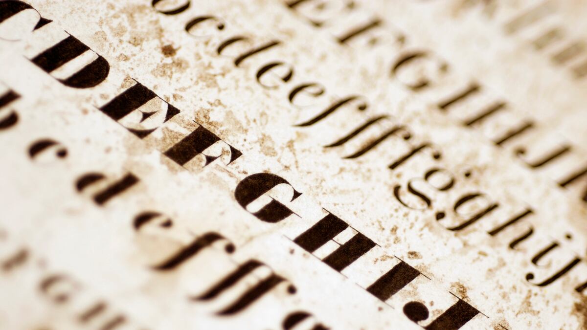
Reading Simon Garfield’s delightful Just My Type will remind you of those high school teachers who’d get distracted and go off topic for half a class period—the interesting thing was that you usually learned more from those teachers than the more disciplined teachers who never strayed from the lesson plan. But maybe Garfield can’t help himself, since one of his points is that to understand typography, you’ve got to understand how it works in real life—type is one thing when lying in a compositor’s typecase and altogether a different entity when found on a street sign, a campaign poster, in a headline or tattooed into someone’s arm.
Or maybe Garfield’s just found the perfect subject for his considerable talents, a subject that lets him ramble, instruct, and amuse, all at once. Here he is explaining why the Helvetica (from Helvetia, the Latin for Switzerland) typeface is so widely used and why it has insinuated itself so thoroughly into modern life since its debut in 1957, Garfield writes, “On an emotional plane, it serves several functions. It has geographical baggage, its Swiss heritage laying a backdrop of impartiality, neutrality and freshness (it helps at this point if you think of Switzerland as a place of Alps/cow bells/spring flowers rather than Zurich and its erstwhile heroin problem).”
But let’s back up. Garfield begins with Steve Jobs, and so should we, because without Jobs, nothing about our contemporary interest in fonts makes much sense. It was Jobs who, on an early Apple computer, installed a drop down font menu. Jobs liked typefaces and he thought computer users should have a choice of fonts for what they wrote. Before that happened, you probably couldn’t find one person in a thousand who knew the difference between Garamond and Bodoni, or Baskerville from Caslon, or even knew what those names referred to. Now there’s a documentary about Helvetica, websites devoted to various aspects of typography (maybe not the best but certainly the funniest is Cheese or Font?, in which you are presented with a name and asked to say which it is—it’s tougher than you think), and for the truly obsessed, a periodic table of typography. Can the return of linotype machines be very far away?
Garfield starts his tour of type and its history with Gutenberg and then meanders forward. Along the way he explains how compositors’ shoptalk (upper and lower case, mind your p’s and q’s) worked its way into everyday conversation. He shows us why some typefaces work better on, say, signs, than they do on the page—one example he uses is Cooper Black, the font used on the cover of the Beach Boys’ Pet Sounds album, a font that works well in the headline, but not at all when a smaller point size is used for the song titles. He explains why Comic Sans is the most despised font on the planet and why Garamond is probably the typeface with which children first become most familiar (it is the type used in both Dr. Seuss and the Harry Potter books). He has a great ear for the memorable quote (Beatrice Warde: “Printing should be invisible”). And he devotes an entire chapter to the beauties of the ampersand.

Think of Just My Type is as an eye-opening field guide, like a good bird book. An expert birder can walk you through the woods and have you spotting catbirds and finches where before all you saw were leaves and sunlight. Garfield works the same way. Reading this book will make you more aware of the printed world around you, whether it’s signs on the street or the words in the newspaper or a book. You begin to see how subliminally type works on you—or doesn’t work (that Beach Boys cover). You start identifying the Helvetica on a subway sign or the Bodoni in a Bible. You begin to parse the visual world around you. This is an invaluable little book.


