
When I was a kid, I collected baseball cards. At some point in the intervening decades, all of those cards have vanished, save one: my 1978 Reggie Jackson All-Star card. Somehow I managed to hold onto that one. When I collected the cards, I didn't actually do anything with them, except occasionally browse through them and maybe show them off to friends.
These days, I collect data instead of baseball cards. But like those old cards, some of the data goes unused, although I occasionally browse through it and show it off to friends.
Part of the reason I don't use all of the data that I collect is that I've struggled with the best way to present it. How do you go about integrating data from your activity, sleep, productivity, driving, locations, reading, writing, coding, and blogging into a single unified interface? The data we collect about ourselves should tell a story, and yet, the "dashboards" that I've seen try to do too much and lose the story in the visualizations.
It seems like the simplest way to use the data you collect about yourself is to present it in a kind of timeline. That timeline can serve as the backbone for the story our data tells. But I've never been able to visualize what a unified timeline might look like—until a few weeks ago when I came across a site called Aprilzero. The site represents the sweet spot between data and design.

Aprilzero is the brainchild of Internet entrepreneur Anand Sharma. Sharma tracks just about everything you could imagine, from exercise (runs and climbs) to extensive travel, and everything in between. And yet, he has found a way to bring all of this disparate data together into an elegant design that tells a clear story about his life.
The site—which, according to Sharma, takes its name from the fact that he was born on March 31, one day before April 1, and thus, April 0—is divided into three parts: Sport, which covers fitness and health tracking; Explorer, which covers Sharma’s travels around the world; and Journal, which is his blog. Drilling down into each section provides an increasingly detailed look into his life using the wealth of quantified-self data that he collects. Unlike many apps, which present data unique to their services in simple charts and graphs, Aprilzero fuses the data together to form a unified picture.
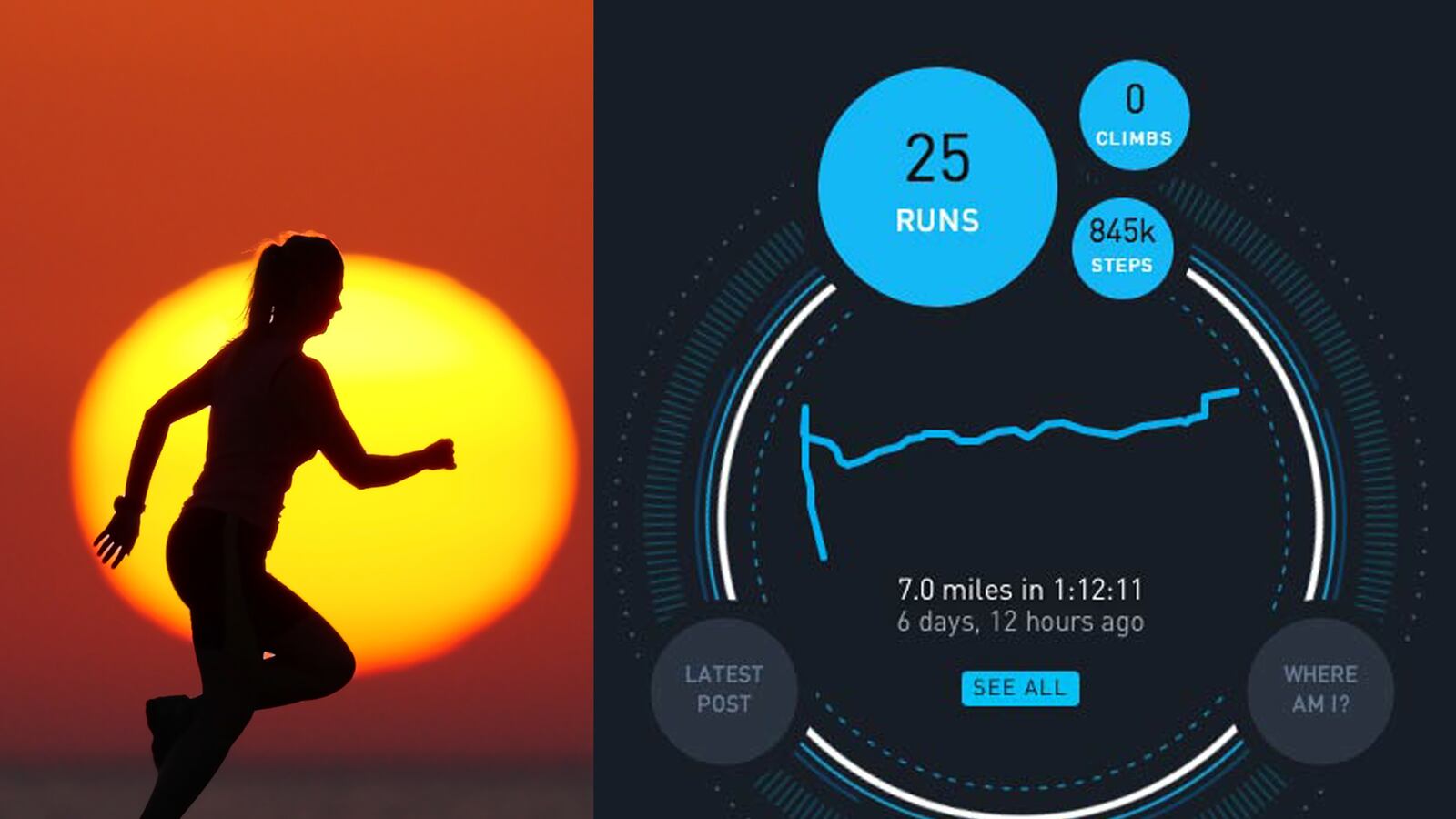
Clicking into the Sport section, for instance, gives a detailed look at Sharma’s fitness and health over time. In addition to step counts, you can see maps of his running routes and scaled difficulties of his climbs. You can also see things like heart rate, weight, and body fat.

Clicking the Explore section presents real-time data on where Sharma is and where he has been.

The data is collected by month, but by clicking on a month, you can drill down a step further into the day-by-day activity. This is where Aprilzero really blazes into new territory. Daily activity is rendered in parallel horizontal timelines, making it very easy to compare one day's activity to the next.

Clicking on one of the timelines, you can drill down one level more into the details of that day across several spectrums.

While Aprilzero renders Sharma’s data elegantly, the data itself is something that anyone interested in self-tracking can collect with relative ease. Sharma collects data that is readily available, much of it coming from apps on his mobile device, like the Moves app, Foursquare, and Cardiio.
By presenting the data in a unified fashion, it makes it easier to glean insights. Instead of seeing just your step count or your heart rate, you see everything. But—and this is essential—it is presented in a clean and elegant manner, one that tells a story over time.
Aprilzero has been up and running since March. I asked Sharma if he'd learned anything from the data that he's collected there so far, and while it’s still early, he said, "Heart rates are... really interesting to track. One time I got back from a trip to New York and my heart rate was consistently in the 80s, about 20 higher than earlier. Then I went for a long run and the next day they were back down to the average 60. That was the first time I realized how strong of an effect what I do has on me—mentally I can sort of feel it too sometimes but actually seeing it quantified is very different and feels a lot more serious."
Aprilzero is the best I've seen so far at what is possible when you have self-tracking data combined with good visualization design. It seems to me that an interface like this—one that does all of the heavy lifting—would open the doors to self-tracking for those who have struggled with how they might use their data.
"I do plan to build something for others to be able to use in a similar way," Sharma said. "I'm currently beginning development on it, calling it the Gyroscope Initiative. It is a much harder problem, because everyone is different and [Aprilzero] was tailored specifically to the kinds of things that I do and answering specific questions about them. But I think the overall philosophy will be the same—capture a lot of good data and then figure out ways to use them to answer questions and visualize trends."
If you are interested in unique ways of visualizing your self-tracking data, I urge you to take a look at Aprilzero. But I warn you in advance: it can be addicting.


