“Just gorgeous,” coos the architect Will Bruder as he looks up, “You’ve got a nice run of pigeon poo.” Bruder is walking around the Burton Barr Central Library in Phoenix with a group of students from Taliesin West, and me. He’s holding court, expounding on every detail, like the oxidation caused by pigeon waste, interrogating public works employees about why fountains aren’t running—and we’re all hanging onto every word, because Bruder and his mesa-like library recently won my favorite of the prestigious architecture awards, the AIA 25. The library is also the latest selection for our monthly series the World’s Most Beautiful Libraries.
The AIA 25 is given every year by the American Institute of Architects to a building that the organization deems precedent-setting and which, the organization says, “has stood the test of time for 25-35 years and continues to set standards of excellence for its architectural design and significance.” Past winners have included Frank Lloyd Wright’s Guggenheim, Louis Kahn’s Salk Institute, I.M Pei’s Louvre Pyramid, Frank Gehry’s Santa Monica House, and Maya Lin’s Vietnam Memorial. (The Pritzker is the industry’s biggest award, but that goes for an architect’s body of work.)
Bruder, 75, has a full head of gray hair and is rocking a long scarf–a bit of flair that makes one immediately think of Frank Lloyd Wright’s signature sartorial accessory. Bruder came to Arizona in 1967 to study with Paolo Soleri, the controversial architect who apprenticed with Wright and created the iconic Arcosanti. Over the past three decades Bruder has become one of the most prolific and critically acclaimed architects working in the American Southwest, and his signature project was the 1995 central library for the city of Phoenix.

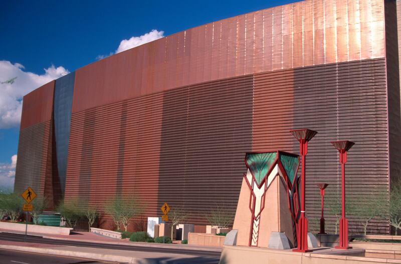
Exterior of Burton Barr Central Library
Phillip Augustavo / Alamy Stock PhotoHis work pulls from the surrounding landscape–his buildings are often a metaphorical representation of something in the area, and in the library’s case the obvious inspiration is a mesa. (It’s a metaphorical form Bruder would take to even more explicit lengths at Reno’s Nevada Museum of Art.) Seen from the highway, the library is a giant hulking curved copper form and one could be forgiven for thinking it might be a stadium.
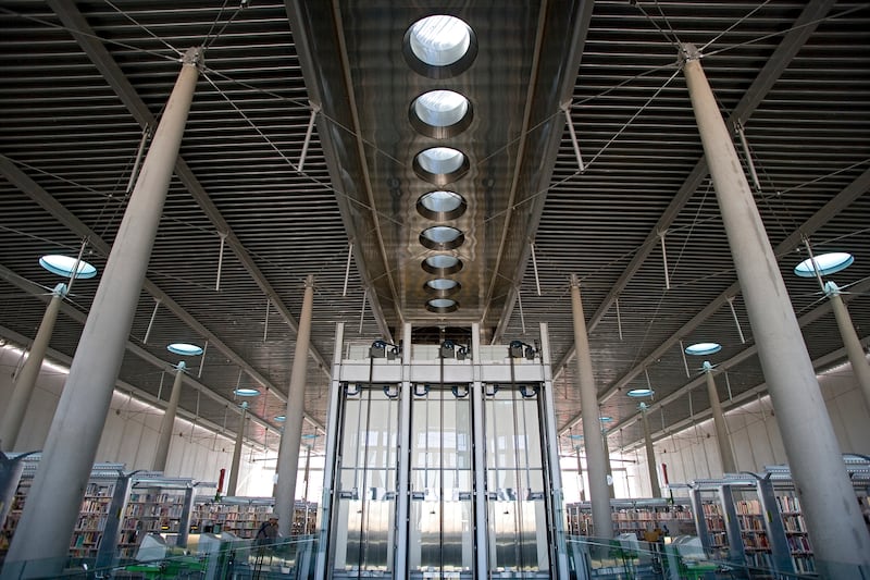
From its north and south facades, though, one could think they were looking at something having to do with the aerospace industry. It’s a feeling that’s only heightened in one of the library’s two signature spaces–the Great Reading Room. Occupying the entire top floor, it makes you feel as if you’re in an unmoored airplane hangar. The candlestick columns are not actually attached to the ceiling and the facade of windows floats above the metastasizing Phoenix skyline. On the southern side you can even see planes taking off and landing in the distance. This is a space I could have dawdled in, grabbed a book, and gotten lost–one worthy of emulation and adoration.
Bruder once said that the landscapes in Western cities are much better than the architecture. This could be taken as a slight, or it could be taken more as a comment on just how impossible it is to compete with the terrain. Even the library’s bathrooms look out through the perforated copper skin to the mountains and desert beyond. One interesting note about the bathrooms: There are no doors. Libraries once had a problem with what Bruder calls “razor users,” i.e., people who would go into the bathroom with a book and a razor to cut out the dirty pictures. They’d get fair warning when a door would open and shut so now no door to warn them that somebody is coming.

The Great Reading Room
ART on FILE, Inc.Descending the concrete central stairway, you pass through the various functional rooms of the library–spaces devoted to teenagers, toddlers, special collections, media, and so on. The spaces are filled with light and the shelves seem to beg you to browse. On the other floors the columns are topped by curved capitals meant to evoke saddle bags, and when I ask about them, Bruder starts to explain how he likes curved forms and softness before he swivels back and, as gazing fiercely as if it’s occurred to him I’m up to something nefarious, growls, “You’re not going to call my building brutalist!” It is soft modernist, he says.
I suspect part of the other draw for critics when it comes to Bruder is that he is the anti-Calatrava. He talks often about how architecture should match not only its functions and surroundings, but also its budget. It was his biggest lesson from Soleri, he says: “It was all about invention with modest means, and never assuming you couldn’t do something because you didn’t have the money to do it conventionally. What I took away from him was the ethos of looking at materials in new ways, trying to find the extraordinary in the ordinary.” Burton Barr needed to be built for less than $100 a square foot, and it was. Nothing inside looks expensive, but neither does it look cheap or in need of repair. It looks like a great, modern city library that you’d be surprised to find out was actually built nearly 30 years ago. And its clever and soft touches elevate it above its modern industrial forms.

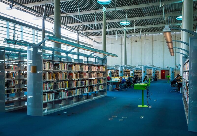
The stacks in the library.
Juliana Swenson / Alamy Stock PhotoThe bottom of the stairs is ringed by a water pool meant to evoke an oasis in the desert. Around the corner from the elevator bank (fastest in the city, Bruder claims) is the second signature interior space–the Crystal Canyon. One enters the building through below-grade slots on either of the copper sides and goes through a low-ceilinged hallway that gives that classic compression and expansion trick when you enter the central hall. The Canyon soars upwards and forms the building’s core while attempting to set the tone for visitors with “the uplifting nature of a library,” he explains. It also hosts a Pomodoro sculpture Bruder rescued at the time that the city was throwing out.
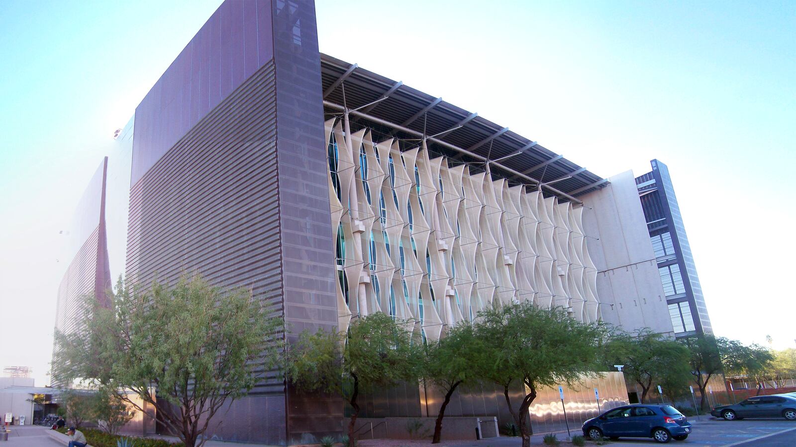
While it’s obvious even to the untrained eye why the inside of the library has remained both enthralling and functional for visitors, the exterior is maybe not as comfortable a form for those used to traditional or sleek libraries. It is hulking, which makes sense given its inspiration. Now, whether a mesa is the right form for a building to draw inspiration from, well, that’s in the eye of the beholder. But for me there was something about this form that made it feel as though entering it was like cracking open one of those great monoliths and discovering its treasure inside. On the north side (the one that looks like it is lined with canvas flags), you can see the true structure of the building as a concrete and glass box with the copper sheathing providing the curves. If you look closely, you can see that the area between the skin and the actual building contains all the emergency exits, mechanical rooms, IT, etc., so that the interior is flexible for changes.
Bruder chose copper because Arizona is the Copper State, and for the most part it looks exactly the same as when it opened a couple decades ago because copper doesn’t turn green in the desert. That is, except for the pigeons that roost in the perforations and whose droppings provide streaks of green–”like lichen in a slot canyon!” he says. Along the base the copper has also turned green, but that’s from humans. Given that Bruder made people nervous when he first got the commission because of his “reputation for weirdness” it’s no surprise that this is a man who gushes about the unexpected beauty in piss stains on his building.
“Libraries should give us a place to dream,” Bruder says to me. “Along with museums they are the ultimate gift you get to do as an architect.” Walking around and seeing it so much in use and reading the press both locally and nationally ever since it debuted, it’s clear that this space is the ultimate gift to a city–a space both functional and inspiring.

