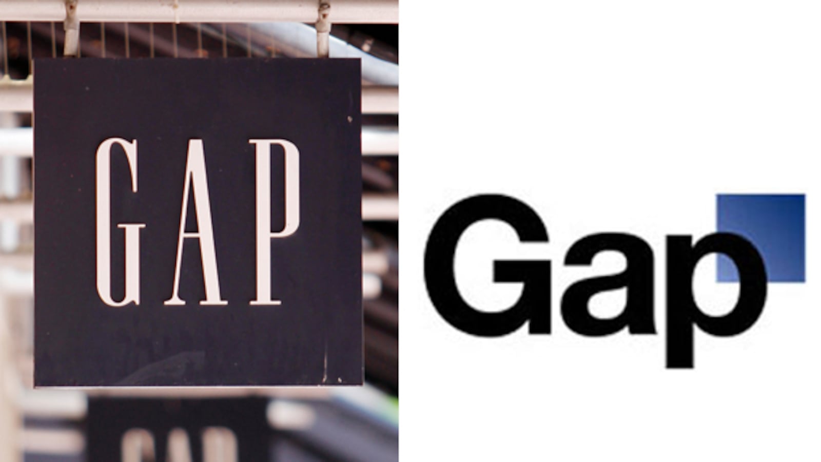

Never mind. Less than a week after the clothing giant remade its iconic clean, structured logo that had adorned jeans and hoodies for more than 20 years, it has already shelved the new one. Designed by Trey Laird and his firm Laird and Partners, who have served as GAP's creative directors for many years, the new logo was intended to be “a more contemporary, modern expression.” The font was changed, the all-caps ditched, and the blue box shrunk to a corner. After getting loads of grief from customers and their online community, what was old is new again. However, the company left open the possibility of the logo changing or evolving in the future. Let's just hope no one freaks out when the blue block temporarily goes red for the holiday season.
Alan Diaz / AP Photo
September ushered in a revamped logo for iTunes, a product that reigns king in design. After Steve Jobs announced updates to the iPod, he introduced users to the neon blue bubble with a double-clef music note in the middle. The new iTunes10 logo is supposed to emphasize the new social media capabilities of the music storage program. Jobs ditched the compact disc—so 1990s—and replaced the new logo, but not without a few complaints from advertisers and users. But there's one defender of the new design: Twitter user @iTunes10icon bio reads: “The baddest motherf--king icon you ever did meet.”
Paul Sakuma / AP Photo
In keeping with the zeitgeist, coffee company Seattle's Best introduced a new logo in May 2010 that dispenses with antiquated notions like aesthetic appeal—and literacy—in favor of a sleeker, more to-the-point design. Judging by the reaction of coffee fans, one wonders if the new look was an act of sabotage by the coffee house's erstwhile, and now owner, Starbucks. The logo reminded Seattle Weekly writer Caleb Hannan of a cross between Target and Red Cross blood drives, “Which is the opposite of appetizing,” he wrote. “Unless you're a vampire in the market for cheap floor lamps.” This new iteration looks like the label you'd see on a food pill in the cafeteria of a spaceship en route to planet Bland.

When MTV got a new logo in February, lopping off the bottom of the icon and with it the words “music television,” it was less a reinvention of self and more a recognition that the channel had completely betrayed its original purpose. The music videos that once filled hours on MTV had long since reduced to a trickle. Their place on the channel has been supplanted by reality television, triumphantly at first with the Real World, which in the 1990s pushed social boundaries while pioneering the genre, and these days with the vapid whimper that is Jersey Shore. In the new logo, stills from various MTV programs fill the empty space inside the once-iconic “M.”

The Internet services and media company formerly known as America Online was spun off by parent company Time Warner as an independent company in 2009, and a new, decidedly uglier logo came with it. Although AOL's second logo, which lasted from 2006 to 2009, paled in comparison to the original, the redesign, with its unnecessary punctuation, looks like an Internet slang abbreviation pasted over an inky, police-administered fingerprint.

We hate the Swedish furniture store's instructions, and we hated it just as much for switching fonts. After 50 years using the Futura font for its annual furniture catalog, IKEA moved to Verdana, sending typography fans and web designers into a tizzy. Verdana is regarded as “cheap” amongst typographists because it's a product of Microsoft Word. Web designers know that Verdana “has become one of the most widely used fonts on the web ( but rarely ever used in print).” IKEA says they were trying to accommodate for the furniture names, which now contain Asian characters. Regardless, it still leaves font-enthusiasts in tears when the mostly widely anticipated summer catalogue is sans-serif.

Tropicana president Neil Campbell admits that he " underestimated" the deep emotional bond of the brand's original logo when the juice giant switched from everyone's favorite straw-stabbing-an-orange logo to a sleek design incorporating a glass of orange juice and a sideways "Tropicana" label. Last February Pepsi Co worked with New York-based Arnell Group to create the new carton's design. But almost two months later, Campbell was apologizing to the “fraction of a percent of the people who buy the product.” Bloggers and OJ fanatics alike were calling the new packaging “ugly” and demanded the company go back to Sterling Brands' original logo. Orange you glad it's back?

The old logo of the specialty consumer electronics retailer, a yellow price tag, was clever in its simplicity; it was also representative of a brand that stresses low cost and convenience over all else. However, the new Best Buy logo, launched in October 2008, is more elegant, sleeker, and corporate. Although the new logo represents the company's apparent desire to appeal to a more high-end market segment—and perhaps to avoid any confusion with the now-bankrupt Blockbuster - it's a definite downgrade.

Shortly after Pepsi unveiled its new logo, a 27-page document was leaked that purportedly outlined the thinking that went into the $1 million redesign by the marketing firm Arnell Group. Though apparently inspired by elements as diverse as the Parthenon, the Mona Lisa, Earth's magnetic fields, the gravitational pull of the sun, and the universe's rate of expansion, in consumers"minds the flashy new design didn't really achieve any of those things. Instead, it was the butt of jokes that repurposed the design to look like a ninja head or a plump man in a red shirt and blue shorts.
Getty Images; AP Photo
Although the television channel's slogan reads “surprisingly human,” what was done to the logo for Animal Planet was inhumane, to say the least. On February 3, 2008, the animal-centric channel's literal (and cute) logo of an elephant and a globe was replaced by a new design by London-based firm Dunning Eley Jones, and it's basically a jumbled mess. Why is the ‘M"so big and pointed sideways? Is it supposed to represent an animal of some sort? Regardless, it looks very mechanical and, ironically, quite unnatural.

Designer Willie Olins writes that the logo for the London Olympic games was created to be “instantly recognizable symbol and a universal form,” which it is because it looks like the love-child of Fraggle Rock and graffiti. The design, which comes in colors like bright pink and neon green, took two years to make and cost £400,000 ($639,000). But once it was revealed in June 2007, there was so much outrage that the BBC requested readers to suggest alternate logos and 50,000 people signed a petition to remove it. Officials at London's Organizing Committee say that the logo is here to stay. Former Prime Minister Tony Blair said that when people see the brand they will be “inspired to make a positive change in their life.”

Colonel Sanders has gone through many changes over the years, but the most recent is arguably the most troubling. The old KFC design, which debuted in 1997, was replaced in November 2006 with the latest incarnation. And, while Colonel Sanders' thick-rimmed glasses, goatee, and string tie are all there, a red apron has replaced his signature white double-breasted coat, and the good Colonel's face has apparently been botoxed to remove every last wrinkle. Now, he looks more Hollywood than Kentucky.

Mastercard kept its logo redesign in 2006 simple, removing its name from the famous concentric circles, then placing a dirty, off center and out of focus lens atop them. Beneath the image is the new name of the corporation formerly known as Mastercard International, Mastercard Worldwide. In a press release the company said, “The launch of the new corporate brand identity follows an extensive analysis of the MasterCard brand and the value proposition it represents to constituents.” Mastercard Worldwide: Because nothing says corporate America like insipid jargon and pointless name changes.