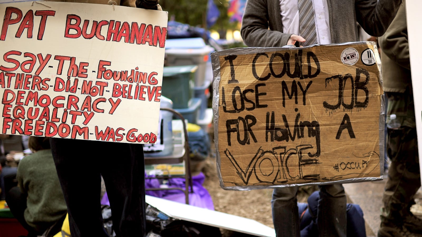
Cheap ink-jet printers have changed the way our world looks. “Back in ten minutes”; “Lunch special—beans and franks”; “Gone fishing”—such signs, once hand-scrawled, have been replaced in all but the greasiest spoons by tidy ink-jetted messages. They happily sacrifice personality for legibility.
Not at Zuccotti Park in New York. The protesters of Occupy Wall Street have been getting their act together for weeks now, improving food distribution and neighbor relations and media messaging. But their signs are as scruffy as the day they arrived. Pay the occupation a visit, and you’re lucky to find a sheet of yellow construction paper hand-lettered in red magic marker. More common is a scrap of used cardboard box, unfolded and scribbled on in Sharpie. The message may be a bold “Eat the Rich,” but its delivery is a mess.
And that, it seems, is often deliberate. “I think what we’re trying to emphasize is that normal people making their own signs can get the message across better than a bunch of perfectly-made signs,” says Mark Bray, a member of the Occupy Wall Street press team who was at the park taking questions. In its early days, the occupation had a station where sign-making was organized and supervised, Bray says, but now they’re letting protesters go it alone. “It’s more personal if a sign is handwritten,” says Bray, contrasting that to union marches where every marcher carries the same Helvetica message.
“You have to have some soul in here,” says Olya Ayzenshtat, a slim twentysomething with a “soulful” sign that reads “Solution: Simple! BUST UP the BIG BANKS,” scrawled in two colors of blue marker, with accents in crimson. (They match the color that she’s dyed her hair.) Her friend, Nicole Stevens, a 24-year-old who’s come in from Long Island, carries a poster with a similar message whose letters evoke the third grade. “The written ones just draw more attention and show more effort. Anyone can just print one out,” she says. The funny thing about this duo is that their craft-corner signs are meant to promote a high-tech product, an e-book that’s been launched at dailynational.com, a site that specializes in Web radio and TV. That points to one of the contradictions so much on view at Zuccotti: The most tech-savvy of demonstrators are eager to avoid the appearance of Microsoft polish.

It turns out that Olya and Nicole didn’t even make their own signs. They were produced by others, under the watchful eye of Karl Kappler, an earnest 31-year-old whom they led me to. “I was the art director,” he says. “We want to make it look as organic as possible. That’s the message around here. … I just don’t think a Kinkos sign is as effective.” Or as one actual third grader puts it, “You can use your own way of doing it.” He’s Nyzhae Anderson, an 8-year-old who has traveled from Reading, Pa., to brandish a hand-lettered sign that reads “I am the future education Not Prison Nation.”
The funny thing is that all these champions of unaesthetic “authenticity” are in fact following in a hallowed aesthetic tradition. Even in 16th-Century Italy, homeland of so much artistic polish and sophistication, a lot of older art could be preserved, even venerated, for the power of its crudeness. Michelangelo himself revisited earlier medieval works, by Giotto and others, “for their aura of religious authenticity,” according to a book on the great artist by scholar Alexander Nagel.
By the time modern art hit, “the authenticity of the primitive” had become a full-blown cliche. (In 2002, when the great art historian Ernst Gombrich published his final book, it explored “The Preference for the Primitive” across two millennia.) Looking at some school-room drawings, Picasso famously said, “When I was a child I drew like Raphael. I have been trying to draw like these children ever since.” And, of course, such a quest was as sophisticated, as unprimitive—possibly as inauthentic—as anything could be.
But there may be more than empty style to Zuccotti’s primitivism. It may specially suit what’s at stake in its protests. During the civil-rights marches of the 1960s, protesters often carried carefully-made signs that bore a single, legible message. “I Am A Man,” read the ones in Memphis in 1968, printed by the hundreds in clean black-on-white. Their authors had a big investment in proving the good order that reigned in their un-primitive thoughts, and they needed to get a single message across, clearly.
At Zuccotti, however, “there are so many things people are upset about,” explains Kappler, that “art director” from dailynational.com. “There’s no one, simple solution to the problems.... It’s not that there’s no message. There’s no one message,” says Kappler—so the posters have to be as varied as the issues at hand.
Or, if there is a single message, it’s that slick corporate creatures—the Kinkos of this world—are the source of our decline. They are the true primitives among us, and we shouldn’t imitate them.


