Maybe we’ve been a little too hard on oil money.
It’s long been a cliche for arriviste tackiness. But a recent trip of mine to a former oil capital of the world—Tulsa, Oklahoma—proved a reassessment was in order.
In fact, so overwhelming was the amount of preserved early 20th-century architecture that on our last day we turned to one another and declared, “I don’t think I can see another Art Deco building.” (And we love Art Deco).
Even more unexpected was that Tulsa is home to a complex of the most fantastic futuristic buildings I have ever seen—all on the campus of an evangelical university founded by one of the most controversial pastors of the 20th century.
I was in Tulsa because word had trickled out that this eastern Oklahoma metropolis was tragically overlooked, making it a perfect fit for our twice-monthly series on underrated destinations, It’s Still a Big World. But I was also in Tulsa because it houses what I’ve long considered one of the greatest works of religious architecture anywhere in the world—Boston Avenue Methodist Church.

Boston Avenue United Methodist Church
Manuel HurtadoMy epiphany began with the descent of the plane—while I’d been expecting a dusty brown expanse, Tulsa in May is lush. Upon landing we popped over into the Gilcrease Museum before heading downtown. The museum houses one of the largest collections of American West art and artifacts (from the Native Americans to Remington on through movie Westerns) that once belonged to Thomas Gilcrease, an oil millionaire of Creek heritage.
After checking into our hotel (recently restored in full-on Art Deco extravaganza, the Tulsa Club Hotel is from Hilton’s Curio Collection) we tagged along with Ted Reeds of the Tulsa Foundation for Architecture to kick off why we were here—the city’s spectacular buildings.
We began in our hotel, which was once the Tulsa Club and designed by Bruce Goff at the astounding age of 23. Goff, who was born in Missouri but grew up in Oklahoma, was apprenticed to the well-known Tulsa firm of Rush, Endacott and Rush at just 12 years old.
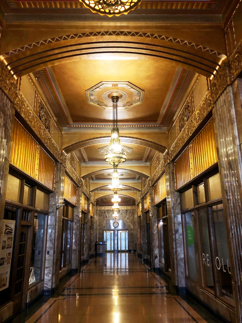
Reeds walked us first around downtown Tulsa, a small area that packs a concentrated punch for architecture lovers. There is the Philtower (Art Deco exterior, dramatic Neo-Gothic interior) and the Philcade (Art Deco explosion of gold, red, and marble inside), both built by oilman Waite Phillips. The shiny white Mid-Continent Tower, with its original 16 stories towered over by the 20-story addition cantilevered on top of it. 320 South Boston (once the tallest in Oklahoma) with its dark and ornate interior. My personal favorite, the Mincks-Adams Hotel (now being converted into apartments), straddles Art Nouveau and Art Deco. The Oklahoma Natural Gas Company Building. Union Train Depot. Christ the King. Public Service of Oklahoma Building. The intricate building directories and elevators that fill each lobby. The Mid-Century Modern Vault. The BOK Tower by Minoru Yamasaki (locals joke that he just took his designs for the World Trade Center buildings and chopped them in half).

The Philcade lobby in all its Art Deco glory.
Loic CardinalThen getting in the car for a short drive to the suburbs (which are early 20th-century McMansion overload), one finds Westhope, the mansion Frank Lloyd Wright designed for his cousin Jenkin Lloyd Jones from 1929-1930. Today, a bit run-down and privately owned, it’s a fascinating example of Wright in transition and his tendency to experiment with new materials in situ. It was one of the last of his Art Deco-heavy projects, and one can see elements throughout that would be perfected in later iconic homes like Fallingwater. It is a famously leaky house though, especially since Wright used a flat tarred roof covered in paving stones, and there is a great story in which one day Jones called Wright, yelling, “Dammit Frank, it’s leaking on my desk!” To which Wright replied, “Richard, why don’t you move your desk?”

Westhope, designed by Frank Lloyd Wright
Joffre Essley/flickrPerhaps one of the best examples of the wealth created in Tulsa and the legacy left behind is one of its house museums—the Philbrook. Built by the same Waite Phillips and his family, they turned it into an art museum showcasing their collection and opened it to the public. It’s actually an incredibly tasteful house as far as Italian palazzos in American go (although one must work to ignore the ugly addition added by the museum in later years). And the collection has the requisite number of “significant” works to be a serious place. But most endearing to me was their attempts at keeping up with the times by doing something like hanging Kehinde Wiley in a room with Gilbert Stuart and Baglione.
Our final stop with Reeds was one I’d requested thanks to a tip—Oral Roberts University.
For the unfamiliar, Oral Roberts was one of the most controversial American religious figures of the 20th century. He is seen as the creator of the prosperity gospel and seed faith movements (basically that those who get wealthy do so because God wants them to). As Michelle Goldberg noted in her piece upon Roberts’ death, “In the 1950s, in a gambit that’s become common for prosperity preachers, he promised radio listeners that God would repay every dollar they sent to him seven times over. His genius was to market faith like an investment, one that would pay predictable dividends to true believers.”
While his university (of which Joel Osteen is a dropout) is more famous now for its fitness obsession, it’s one of the most visually spectacular places I’ve seen, and I’m at a loss to explain how Instagrammers aren’t flooding the place.
Designed by local architect Frank Wallace and constructed in 1962-63, it’s a Googie (futurism inspired by automobiles, planes, and space) complex that can be best described as a fusion of Oscar Niemeyer, Richard Neutra, and Bruce Goff. Most stop at the Praying Hands sculpture at the entrance, but they’re missing everything further along. There is the diamond-shaped Learning Resources Center in white, gold, and coal-black that is most notable for its spindly columns ringing it. (The ever-witty interior designer Jeffrey Bilhuber remarked on social media that it was an effect akin to “the time I stepped in gum on the street.”) There are a number of lovely buildings throughout—including dorms with interesting yellow honey-comb brise-soleil—but the other can’t-miss is the Prayer Tower, an observation deck crossed with a carnival paratrooper that is very clearly inspired by the Seattle Space Needle, only if they’d gone barking mad while decorating it. I loved it.

Oral Roberts University Prayer Tower.
Andre Jenny / Alamy Stock PhotoTulsa is also a great jumping-off point for exploring another overlooked gem—northwest Arkansas. Its most famed attraction is the Moshe Safdie-designed Crystal Bridges Museum, a mere two-hour drive from Tulsa and home to the fantastic art collection of Alice Walton (i.e. Walton of Wal-Mart, a family with a collective $163 billion net worth). And along the way was a place long on my architectural bucket list, E. Fay Jones’ Mildred B. Cooper Memorial Chapel in Bella Vista.
Jones has long been the most criminally overlooked American architect of the 20th century. Perhaps it is because most of his work exists in Arkansas and Mississippi. Whatever the case, he is the subject of few retrospective coffee table books (an informal marker I use to measure how tastemakers hold or don’t hold an architect in esteem) and is far from a household name despite being the only one of Frank Lloyd Wright’s protégés to also win an AIA gold medal.
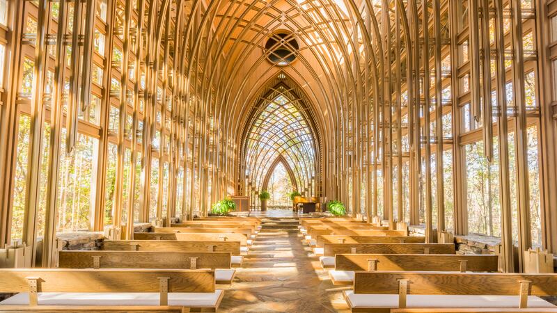
For those who have come across Jones, they’ve most likely seen one of his chapels—and with good reason, as they are, in my humble opinion, perfection. The Cooper Chapel is situated in a sylvan setting next to a lake. From the parking lot, it’s reached by foot along a winding path, which Jones cleverly laid out through the forest such that you don’t get a glimpse of the chapel until the path straightens out and, gasp, it’s right in front of you, a vision in curved wood and glass right out of Rivendell. It bears a resemblance to a chapel by another of Wright’s proteges, none other than Lloyd Wright Jr. and his Wayfarer’s Chapel outside of Los Angeles.
In Wright-style organic architecture brought to its maximum potential, the Cooper Chapel takes the classic Gothic arch and manipulates it by use of material (wood, glass, and steel painted the color of wood) and repetition such that the chapel is the farthest removed from the shock-and-awe of Gothic cathedrals but it manages to similarly knock you flat.

The Mildred B. Cooper Chapel interior
Eddie BradyOf course, that was just a warm-up for the true architectural delight back in Tulsa—Boston Avenue Methodist Church.
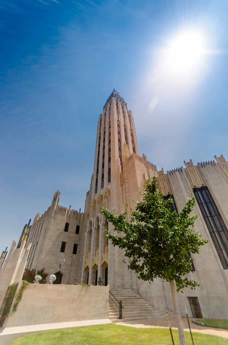
The tower is the first thing you notice from afar. And you do notice it from afar, as the church is situated at a curve in the road such that from downtown it dominates the Boston Avenue vista. As one Tulsan remarked at the time, “It is a commanding site. As you drive toward it down Boston Avenue, the church overpowers you. My God, you can’t get away from it.”

The crown of Boston Avenue's tower.
Loic CardinalThe 258-foot tower is an Art Deco/Neo-Gothic fusion skyscraper in miniature with its clever interplay of chevrons and decorative pieces throughout, offering more details to the eye with each lingering second. Lining its face are four angled glass shafts meant to reflect sunlight, and it is crowned by a steel and glass finial with four zig-zag fins. At its base are three angled arches topped by goldenrod terracotta statues by Robert Garrison of John Wesley (founder of Methodism), his mother, and his brother Charles (who wrote more than six thousand hymns).
With the tower alone, your traditional Methodist church this is not.
But before going into the rest of the church, it’s impossible to do so without addressing the church’s origins and the major controversy surrounding it.
As the parish community that would make up Boston Avenue Methodist grew bigger in the 1920s, the need for a new church was apparent. A committee was set up, but after touring Europe, the couple running it were keen on not having a traditional church. But firm after firm failed to come up with a suitable proposal that met the committee head’s desire for “a church before which he could stand in the rain and let it talk to him, and with an interior that would impel him to worship whether he wanted to or not.”
Now here’s where it gets complicated and I won’t come down on either side in this piece. The committee chairman’s wife was involved in some arts organizations in Tulsa and through those knew Adah Robinson, a local art teacher and lecturer. Now either Adah Robinson went off and came up with some drawing of her ideas that later became the church, or according to others, she went off to her former student Bruce Goff and had him draw up her vision. Goff is another criminally overlooked 20th-century genius and according to LIFE was “one of the few U.S. architects whom Frank Lloyd Wright considers creative.” (He recently got some much deserved attention in the New York Times Magazine.) His designs, whether they ended up being realized or not, are some of the most fun manifestations of a human’s creativity. He was also gay, and was forced out of the University of Oklahoma for “contributing to the delinquency of a minor” though that is now treated with skepticism.
Either way, when Robinson presented to the chairs, they loved it and slowly it got approved.
But because Robinson was not an architect, they needed to hire a firm to handle the technical aspects. The committee and Robinson went with Rush, Endacott and Rush as 22-year-old Goff was a draughtsman there. The contract, according to More Than a Building: The First Century of Boston Avenue United Methodist Church, called for Robinson “to supervise all the art features” and for the building’s designs and execution to be overseen by Rush, Endacott and Rush and Goff. Because the building would go on to become iconic, the question of whether its genesis was at the hands of an non-architect art teacher (coupled with it being a woman) or the early work of an starchitect is understandably heated.
But standing in front of the Boston Avenue entrance and the eyes work their way down the tower and take in the whole building, the things that stand out are very much those that Robinson had a hand in. There are the 62 praying hands decorating the parapet, which she wrote in a later lecture, were designed to be open because “closed lines and horizontal lines have been associated with finality. Modern lines are flowing, upward, open, free. These modern hands, open, are confident of the receptivity of divine grace.”
In a passage I found incredibly powerful, she wrote that she designed the hands to be this way because “the closed clasped hands of the Middle Ages signify the intensity and fear of the supplicant. These modern hands, open, are confident of the receptivity of Divine Grace.”
Everything about the church is supposed to stretch upwards, to “assure the hurried passerby of the reality of the Infinite.” Ever the art teacher, Robinson declared that, “every line expresses a thought. Look for it.”
The two most common decorative motifs throughout the church are the coreopsis and the tritoma, two Oklahoma wildflowers that Robinson transformed into mesmerizing recurring patterns. They can be found on reliefs, banisters, floor borders, plasterwork, and stained glass.
The entire church cost $1.3 million, which was about double what was expected, but luckily that happened during the boom years of oil. It totals 150,000 square feet and is made of steel, Bedford limestone, and terra cotta.

The peaceful color scheme of the sanctuary where services take place.
Loic CardinalInside, the round sanctuary where services are held is jaw-dropping in a different way. A circular wonder in wood, pink, and white plaster, where the outside was all ooh’s, this is all aah’s. It is partially lit by vertical stained glass windows (there are 11,500 square feet of leaded and stained glass windows throughout) inset at angles to allow play with the light.
Tours like I had of the Boston Avenue can be arranged via the church, but after being inside (something I never really paid attention to, the exterior is always what pulled me) next time I hope to see a service in this space.
While Boston Avenue was the main draw for me, Tulsa has been in the news of late for a different reason—a determined billionaire and the park he has built.
That billionaire is George Kaiser, who made his billions in oil, gas, and banking. Since creating the George Kaiser Family Foundation, he has plowed hundreds of millions (not without controversy) back into Tulsa focusing on health, education, culture, and urban environment. But the recent press is because of a $465-million park his foundation built right on the Arkansas River just outside downtown called the Gathering Place. (Readers should definitely check out Janna Zinzi’s recent piece on how it fits into Tulsa coming to grips with its ugly past over race issues.) We took Lime scooters (they’re everywhere in Tulsa) and motored our way over there on our last night to see if it lived up to the hype.
I live in Washington, D.C which has multiple world-class parks, The Daily Beast headquarters is on the High Line, and I travel the world which has lots of amazing parks, but off the top of my head I can’t think of a major park built from scratch in recent years as nice as the Gathering Place. The amenities, from the mini-marina to the playgrounds to the bridges were just fantastic. But best of all, the place was packed with people playing, running, walking, or just hanging out. Which is all that matters, really, no matter how many bells and whistles you throw on something.
Throughout my travels, I’ve visited places that blow my expectations and I’ve been to ones that have disappointed—and as an architecture lover who appreciates a good comeback story, Tulsa very much falls into the former category.

