“Bleeds you dry.” “Exuberantly shallow… kitsch.” “Such arrogance.” “An epic boondoggle.” “A one-trick pony.”
That’s just a sample of the invective directed at one of the world’s most famous architects—Santiago Calatrava. While beloved by many for his edgy, gravity-defying, and photogenic works, he’s also probably the world’s most hated architect. So many of his projects blow through multiples of their budget, are accused of not functioning (two slippery pedestrian bridges, an airport without an arrivals hall, and the opera house with seats with no view), or are in constant need of staggering repair and maintenance.
In fact, it’s hard for me to think of any single individual over the last 30 years who is responsible for costing governments worldwide more money for something other than war!
But this is not another rant about Calatrava. Instead, if you’ve been disappointed by his buildings or if you’ve just read one of the many epic take-downs of this easily caricatured artist, I’d suggest you book a flight to Zurich and stroll up the hill on the western side of the city until you find yourself outside a rather ordinary gray stone university building. For inside this unassuming historic building is one of Calatrava’s best works, in fact, one of the best pieces of modern architecture I’ve seen lately, and this month’s selection for our series The World’s Most Beautiful Libraries.
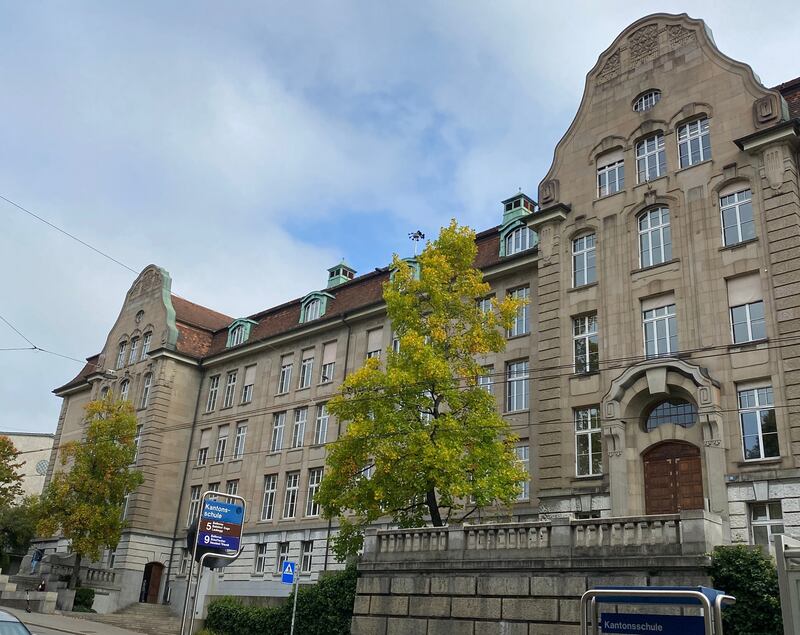
There is nothing wrong with the building that houses the Law Library at the University of Zurich. Its Art Nouveau façade fits in well with this part of the city that arose in the decades after the old city walls came down in 1834. It was designed by Herman Fierz and completed in 1909 as an L-shaped counterpart to the existing mid-19th century preparatory high school such that the two buildings connect to form a rectangular structure with a large courtyard.

The exterior of the Law Library.
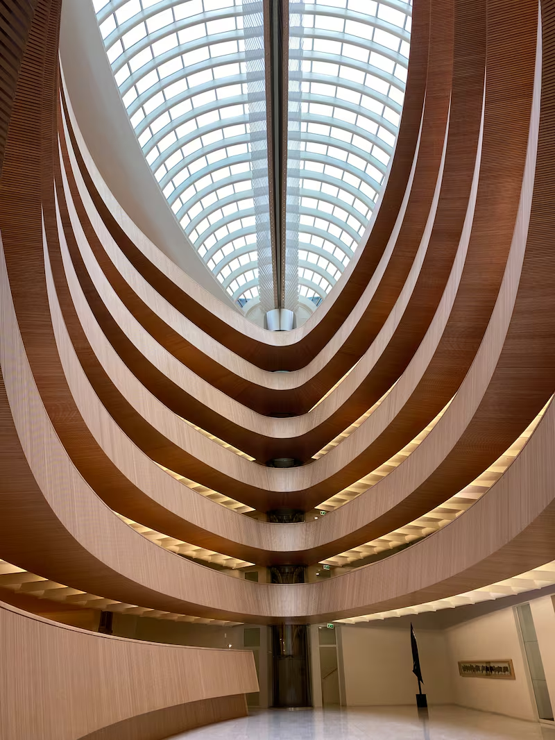
William O'ConnorOver the years the university’s law school enrollment grew and grew until it was scattered all over the university. In need of a central law library, the university in the 1980s proposed an entirely new building. But that was shot down. So in 1989, it turned to the city’s nascent star architect, Calatrava, whose wife had attended the school, to transform the Fierz complex. While the school may have just been looking for an addition that gave it more space, what Calatrava ended up proposing was something far more ambitious, transformative, and yet also modest. He would turn the open-air courtyard of the building into a sleek library of galleries of warm wood lit from above by a longitudinal glass dome.
Calatrava was born in Valencia and while his birth city is the site of his largest project (the City of Arts and Sciences, which looks cool at first but verges on ridiculous the longer you look at it), it was in Zurich that he received his doctorate in 1981, opened his office, and had his first major project—the Stadelhofen railway station, which featured all of his signature tantric swooping structures. He quickly followed it with the two bridges that made him famous: the Bac de Roda Bridge in Barcelona and the truly spectacular Puente del Alamillo in Sevilla (which wasn’t completed until the early 1990s). His defenders might point to his works in the ’90s and their impressive envelope-pushing as Calatrava running so later architects could merely walk.
It was in this period of his lightning-fast rise that he was awarded the library project, although it took a decade to get approved and was not completed until 2004. But to walk into it today is to marvel at how he designed something that after nearly three decades still looks futuristic and sharp.

If the Art Nouveau façade is unremarkable but still lovely, its backside, which is strangely the library’s entrance, is just unremarkable. You enter a nondescript white low-ceiling lobby and then pass through a vestibule—the first step in the classic compression and expansion trick beloved by many architects—before walking into the library hall. Your eyes are immediately, and willingly, led upward from the white stone floor to visually climb the six stories of maple ribs to the dome above. It is an eerie space, part ark and part sci-fi Valhalla where a disembodied voice might announce your fate.
I say disembodied because you can’t see anything except the structure itself. When one thinks about beautiful libraries, old and new, so much of the beauty comes from seeing row upon row of books. For modern libraries in particular, which trend cold in their color scheme and design, the color often comes from the spines of books ranked on the shelves. Calatrava, however, showing how clever he can be, took a look at that long history of library design and said, "Nah." But what he did instead works beautifully. Standing at the bottom of the hall you cannot see a single book or a single student. Instead, the most you get is the occasional throat clearing or the tapping of an especially intense typer (some areas had to be made laptop-free because of how much that sound fills the room).

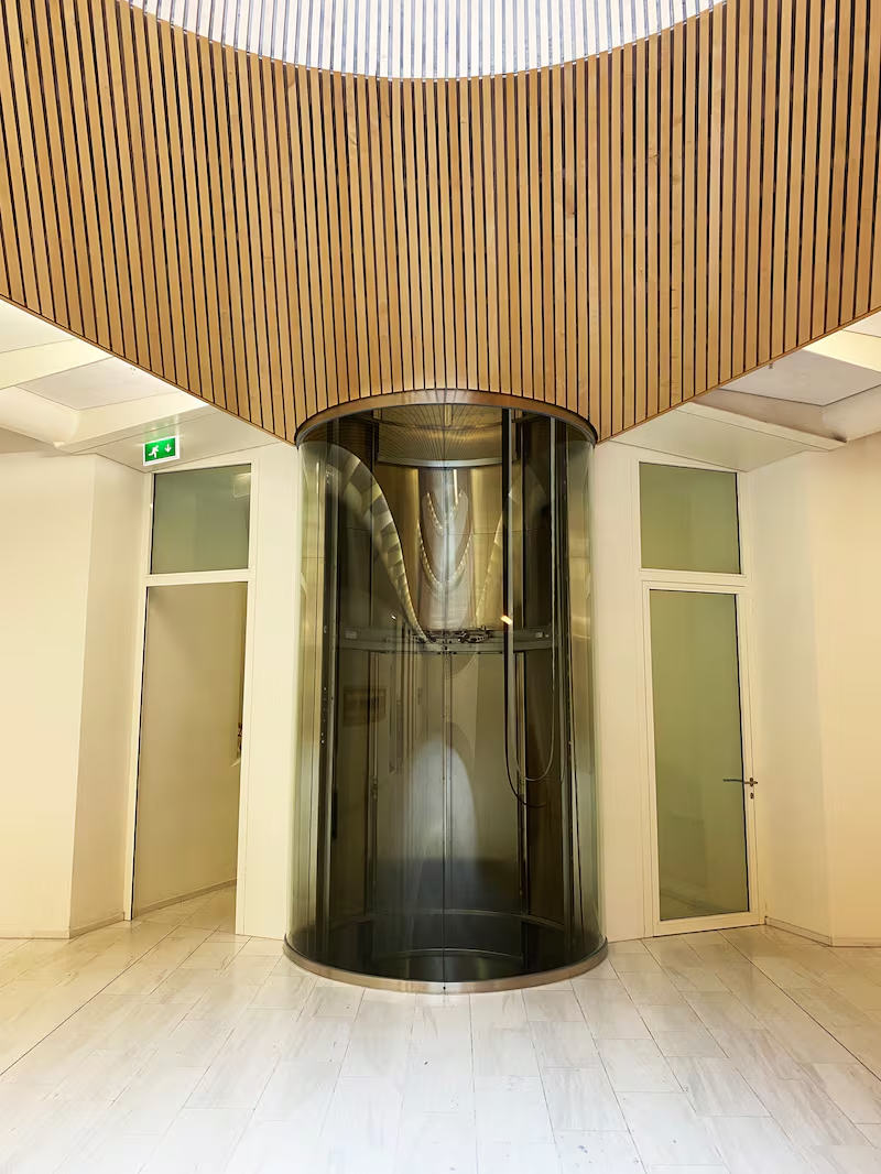
On either end of the space, one finds another fantastic element—glass elevators that look like giant pneumatic tubes. Peeking around them, you see the restored facades of the historic courtyard as Calatrava has essentially hung his eye-shaped library inside it, giving the space what he called a “levitorial character… the library floats in the courtyard as if it were a huge piece of furniture.
As you travel up and down the six stories in the elevator, you finally see the books and the students—a view equally as beautiful as that on the ground floor but totally different. While the view from the ground up feels alien, looking down on stacks of books and students one sees, quite simply, a beautiful library.

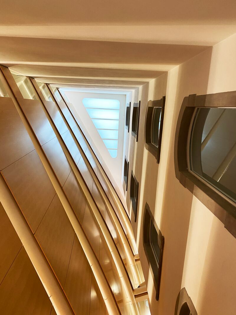
One can see the restored facade of the historic courtyard and the exterior of Calatrava's library.
William O’Connor“It is not a flamboyant work that has to draw attention to itself,” the architect said in an interview shortly after it opened. “It was very important to me to leave something beautiful and functional for the students.”
The library isn’t just an aesthetic marvel, however, it’s also fascinating from an engineering perspective. The dome has what is called an “anti-dazzle device” that not only prevents blinding when the light hits the glass at an angle but it also works to keep the heat up in the dome and absorb some of the sound.
The word I kept coming back to as I (quietly) explored the space was clever. It may be one of the most underrated qualities in modern starchitecture, which tends toward big, showy elements that do well in photographs. But here in this hall, the temptation toward grandiosity removed perhaps by the fact it can’t be seen from the street, Calatrava’s library is a wonderful testament to what architecture can be when genius is not tripped up by the ego.

