
Mona Lisa of the Coffee Shop
February 5th, 2013
The crème brûlée "bismarck" from the Doughnut Plant is a great aesthetic creation

For a foodie, trumpeting the crème brûlée doughnut from the Doughnut Plant, in New York, is like saying that you rather like the Sistine Ceiling. But, on the assumption that not everyone who reads the Daily Pic is a food fanatic, I’m still willing to proclaim this sweet, with its crisp-caramel outside and crème-y filling, one of the great aesthetic creations of recent years. My only problem with that proclamation is that I’d never rave about fine art that was so mild-mannered in its innovation: I ought to demand a blood-flavored cruller with durian foam. Can I take refuge in the thought that the mash-up of French and American pastry idioms gives this donut some postmodern cred? Surely it thematizes globalization and post-colonial cultural collisions, with a nod to neoconcrete anthropophagy?
World’s TRULY Oldest Cat Video
April 29
Joyce Wieland pushes back the timeline for feline films.

Mea culpa, mea culpa, mea maxima culpa: On Friday, I claimed to have found the earliest YouTube-ish cat video, filmed in 1979 by the artist B. Wurtz, but I warned that someone was bound to point out some still earlier contender. That someone was the Vancouver publisher new-documents.org, who immediately tweeted out the fabulous "Cat Food", shot by Joyce Wieland one full decade before Wurtz did his piece. (Click on today's image to watch it – and let me know if you've got a still earlier cat film up your sleeve.) I'm doubly ashamed of my lapse because Wieland (who died in 1998) sits in two categories of artists I follow especially closely: Pioneering women, and Canadians. I know and love Wieland's work, but this piece had passed me by. It suddenly occurred to me that it's a kind of animal lover's tribute to – or piss-taking of – Warhol's great movie "Eat", which I only recently saw (and in which the cat's appearance is too brief to make the piece count as a contender).
Maurice Ravel, Brilliantly Un-Raveled
June 4, 2013
Anri Sala achieves a masterpiece, by taking on someone else's.

Anri Sala's "Ravel Ravel Unravel" project, representing France at this year's Biennale, is the best thing I've seen so far, and one of the best I've ever seen here. I'd need thousands of words to get at its complexities, but here are a few hundred to get us started.
Sala's premise is relatively simple: He gets two great, heroic (male) musicians to record the concerto that Maurice Ravel wrote in 1930 for a pianist who'd lost his right hand in the Great War. In a grand central room of Sala's pavilion, two stacked screens show gorgeous, hi-def footage of each player's left hand as it strikes the keyboard. Although the pianists begin their solos at the same time, and the orchestra recorded with each is identical, their interpretations vary enough for the sights and sounds of their playing to pass in and out of sync. In one smaller side room – the first space you come to in the building – a smaller projection shows a close-up on a woman's face in extreme concentration; the soundtrack makes you think that she's playing the piano, except that her playing seems wildly distorted and fractured. In the building's final space, encountered after the main screening room, the camera pulls back and the woman's task is explained: She's standing at a pair of turntables, like a Hip Hop DJ, using her fingers to stop and start a pair of vinyl discs that bear the pianists' performances. Her goal is clearly to reconcile the two recordings so that their solos can be heard in sync, but the result is a series of hesitations and distortions in the sound as she "scratches" the twin records. The harder she works to make things right, the worse the result.
So much for the premise. Read on for some of my reactions:
- There's a sense of Sala "replacing" the missing hand of the original pianist, by doubling the players. Of course, his new, hybrid musician is a strange double lefty. A fractured body is healed, but its musicmaking is further damaged.
- There's a fascinating tension between the visually powerful moments when we see the pianists' hands flying across their keyboards, and the visually placid moments when those hands are at rest - despite the aural frenzy of the orchestra playing its parts offscreen.
- Surprisingly, the doubled recording of the Ravel is not cacophonous at all. At most, the piece underlines a common notion of Ravel as predicting later, more strenuously modern music. What you hear could be Ravel reworking his own thoughts on music, if he'd lived into the 1960s.
- There's also a sense that counterpoint, which has been Western classical music's most notable feature, has been turned into the aesthetic principle behind Sala's contemporary visual art. It's hard to sort out the echoes and repeats in Ravel's original score and the echoes and repeats introduced by Sala.
- The woman's attempt to sort out the musical jumble comes care of DJ culture, often seen as standing in opposition to the classical tradition and for a rejection of Bachian order. Yet her two hands, delicately working the turntables, come off as strangely close to the pianists' twinned left hands at their keyboards. (Could someone write a piece for a one-handed turntablist?)
- The project is about recording and playback technologies – visual and aural – as much as about live performance. Sala uses different speaker arrays in each room as well as different sound baffling (the central room has foam panels that eliminate almost all echoes off its walls). The separate content in each room is matched, and complicated, by different means of reproduction.
- There's a notable contrast between our sense of being in the presence of intuitive choices being made, as we watch each pianist do his particular thing, and our realization that the actual footage that we watch and hear is set down for good, without the possibility of alteration. In what sense, then, are we actual witnesses to improvisation?
- There's also a lovely match between the way the pianists seem to improvise, but within the narrowest of limits (hence their being often in sync), and the improvisations of the cameramen as they follow the movement of the musicians' hands, pull their focus to different parts of the keyboard or drag our attention from flying fingers of the left hands to right hands not moving at all. And all along we're never sure how much freedom there really is for either musician or cameraman to stray from a script set by Sala – and Ravel. This, you could say, is the tension at the heart of much of the West's performative art.
- There are gender implications. The piece underlines the "maleness" of the Romantic tradition in music – the concerto's one-handedness was "produced" by a war – and then positions its woman as stuck between gigantic male egos, hopelessly attempting to reconcile them.
- A final marker of the success of this strange collaboration between Sala and the long-dead Ravel: Despite the extreme complexity of the piece, visitors stayed riveted for longer than they ever would in front of a painting or photo, or with a classical album. There's no plot, but visitors don't want to lose track of it.
Live SEXXX with Jeff Koons
June 5
The Romanians give us tableaux vivants of past works from Biennales.

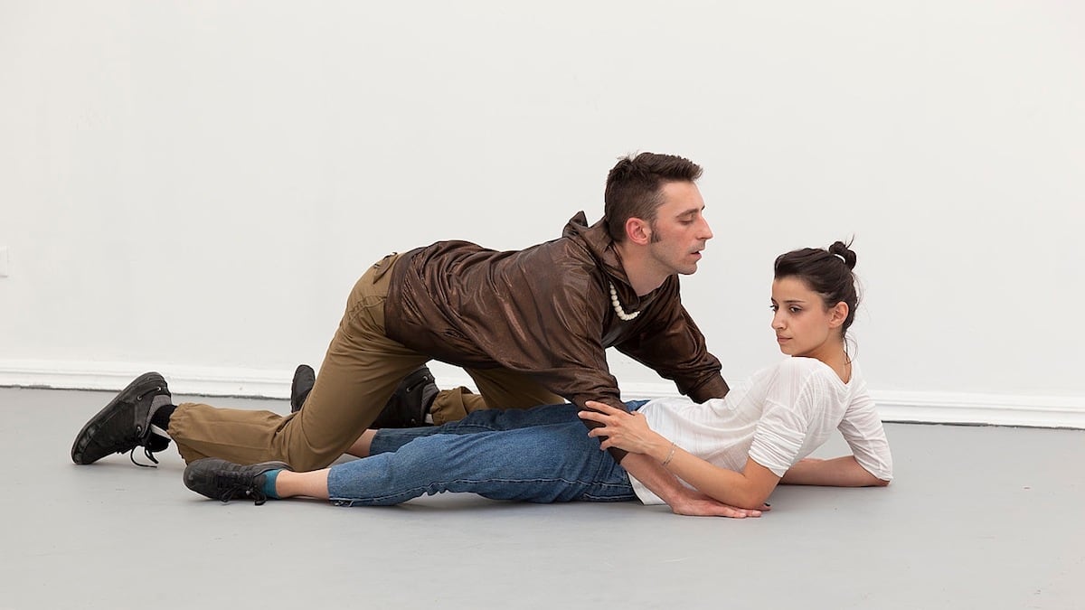
In the brilliant Romanian pavilion, the artists Alexandra Pirici and Manuel Pelmus have paid a troupe of performers to act out an anthology of works from a full century of Venice Biennales, presented in the old-fashioned mode of tableaux vivants. This photo captures them enacting one of Jeff Koons's images of himself having sex with La Cicciolina, the porn star who was then his wife, as shown in Venice in 1990. At other moments the troupe performed the 1924 "Black Circle" by Kasimir Malevich (by lying in a circle on the ground) and a 2007 piece about the political neutrality of the Venice Biennale (a single dancer simply stood there, looking noncommittal). They also gave us charades of a national hero on horseback, in Venice in 1897, and of Edward Hopper's "Hotel Lobby" from the 1952 Biennale (some performers crouched as the lobby's chairs). On first encounter, the Romanians' anthology felt like a wonderful one-liner. On sticking with it, as I did for close to an hour, all sorts of profundities opened up. It came to be about all art as depending on human actions, about how interpretation always trumps the objects themselves, about how everything artists make can be leveled-out to a single cultural genre, and about the "migrant labor" of artists at any Biennale. (This last point I've cribbed from the project's rather good introductory text.) I also came to realize that Pirici and Pelmus's single "gesture" required as much craft and care as any high-realist painting: The performers have memorized all the dozens of works in their anthology, and will be presenting them daily through November.
Blind Faith in Art
June 5
The Daily Pic (Venice Biennale Edition): Artur Zmijewski presents the work of sightless painters as futile, and necessary.

A still from "Blindly", a coruscating video from the brilliant Polish artist Artur Zmijewski, in the Biennale's group show. If Zmijewski's greatest video showed deaf people learning to grunt out a Bach cantata, this more recent one shows the messes blind people make when asked to paint. In my full review of the Biennale in this week's Newsweek, I argue that Zmijewski's video represents the dilemma at the heart of all artmaking today, including in the Venice show: A sense of absolute pointlessness and powerlessness, and a determination nevertheless to go on making art. My review argues that the Biennale's group show valiantly tries, and notably fails, to return art to a time when it had a real function in life. Zmijewski's video acts as the show's own declaration of that failure, but also as an insistence that the effort of artmaking, whatever the results, counts as a success. It so happens that there's research on blind artists that bears this out.
Art at the Scrim-age Line
July 22
Robert Irwin turns a whole room into subtle abstraction.

After the drubbing I gave James Turrell's Guggenheim mess, it's a pleasure to have found a Light And Space work I can get behind. Robert Irwin's 1977 piece, now reinstalled in the space at the Whitney it was conceived for, doesn't have one trademark wow-cool effect, or any paraphrasable point. It's a single scrim of fabric that cuts the room in two, and whose black bottom edge gets extended along all four walls. It has all the complexity of a really superb abstract painting, by Malevich, say, or maybe Jo Baer. A sure mark of its power?: Visitors seemed compelled to stay hushed in the room, even though there was no special reason for silence.
Warhol Goes C.S.I. on Munch
July 29
Andy felt the link between the Norwegian and his victims.

Another of Warhol’s silkscreen riffs on Edvard Munch’s prints, from the show that closed yesterday at Scandinavia House in New York.It was Warhol’s choice to combine the femme-fatale “Madonna" image with Munch’s self-portrait. The pairing gets at a couple of truths. First, that the self-created image of Munch as tortured artist is inseparable from the (impeccably) tortured art he produced – Warhol knowing more than most about such acts of artistic self-creation. Second, that a tortured woman is never without her torturer. (It’s easy to imagine this doubling as forensic: the crime-scene image of a rape victim paired with a mug shot of her rapist.) Again, Warhol, the consumate voyeur of others’ sexual politics, knew all about such ties.
MoMA Buys a Fishy Tale
August 7
Allan Sekula's great "Fish Story" enters the Modern's photo collection.

I was so happy to see this and other photos from Allan Sekula's "Fish Story" in the MoMA show of its latest photographic acquisitions. Sekula's project, shot between 1988 and 1995, represents the informative, content-focused end of the spectrum of fine-art photography, so it's great to see it find a home in a museum thought of (utterly unfairly) as the home of formalist Modernism. (As in the Bill Brandt show there that's closing this week.) Funny thing is, I remember that when I first saw Sekula's images, years ago, they seemed utterly resistant to aesthetic concerns – they were just pure documentation of global trade and labor. Now they look like an established, familiar aesthetic.
A Clone Is Rival for King Tut’s Throne
September 2
In Berlin, copies of Tut's treasures stand in well for the real ones.

King Tut's funeral mask, obviously – or not quite that, since it's a reproduction that I saw over the weekend in Berlin in a big Tutankhamun show that included only reproductions, commissioned by the German rock promoters Semmel Concerts. (Semmel had invited me to a conference to give my usual rant against exhibitionitis.) To my huge surprise, I left the Tut spead unconvinced that a show of originals would have been much better, or more informative. The repro show let you get a very close, long look at objects that otherwise you'd have to fly to Cairo to see, in the much less than ideal conditions of the Egyptian Museum. And the show was surprisingly informative, even pedagogic – sometimes verging on the pedantic – without much of the empty splash you'd expect of a for-profit, mass-market touring exhibition. The one near-fatal drawback was, you could say, epistemological: You had to trust the organizers to be giving you faithful copies, whereas when you see original objects, you have the near certainty that the knowledge on offer in them is real.
NSFW, in 1641?
September 16, 2013
In his portrait of a castrato, Andrea Sacchi let a well-hung Apollo make up for the singer's loss.

In honor of the glorious rehang of the Metropolitan Museum’s European Old Masters, and of the museum’s new Monday hours, this will be the first of the Daily Pic’s “Met Mondays”, a series to run over weeks to come. I want to start with an image that, you could say, is less about art-for-art’s-sake than about achieving an almost practical goal, as is so often the case with pre-Modernist art. In 1641, the painter Andrea Sacchi depicted the great castrato singer Marcantonio Pasqualini being crowned in his art by Apollo – who happens to have the most prominent Old Master penis I know of, staring us right in the face. (Please don’t bombard me now with more prominent ones.) I can only read Sacchi’s gesture as deliberate compensation for Marcantonio’s loss, with the implication that the glory of his art makes the singer as whole as his Olympian patron. I wonder how Marcantonio felt about it?
For a full visual survey of past Daily Pics visit blakegopnik.com/archive.
Warhol’s Piggery
September 17
In 1971, Leee Black Childers documented "Pork", Warhol's only play, in all its scatology.

This is a production still from the 1971 London run of “Pork”, Andy Warhol’s only play, with the actor Tony Zanetta playing the silver-wigged artist himself. The shot is by Leee Black Childers, one of many of her photos up last weekend at the Leslie-Lohman Museum of Gay and Lesbian Art in New York. The other photos, many showing lots of naked flesh, give a sense of how naughty avant-garde theater could get at that time. At the exhibition launch, a reading from the deeply scatalogical, largely non-sensical play gave an even better idea of Warhol’s pleasure in ruffling feathers and breaking rules; even after all these years, the old Warholians at the opening showed how deeply committed his crowd could be to the values of bohemia. If in his later years Warhol embraced the moneyed establishment, it was always with the knowledge that his roots lay outside of it – he enjoyed rank and money as living examples of camp.
Watching Le Corbusier Become Fabergé
October 1
Amie Siegel's new video shows us how utopian treasures become fancy goods.

A moment from Amie Siegel’s brilliant new video called "Provenance", up for another few days only at Simon Preston Gallery in New York. Siegel traces the fate of the furniture designed in the early 1950s by Le Corbusier, with his cousin Pierre Jeanneret, for his government complex in Chandigarh, then the new capital of the Indian state of Punjab.
Siegel begins at the story’s end, as it were, by showing us restored tables and chairs in the homes of Western millionaires – in a London townhouse, a New York apartment and, on the high seas, in a yacht that comes complete with elevator and electric doors. Then Siegel shows us similar pieces set in the fancy shops and auction houses where the super-rich, or their decorators, sourced their finds. (We watch as one Chandigarh table gets hammered down for almost $100,000.) We next see the furnishings in wholesalers’ warehouses and restorers’ workshops, then in containers on ships heading to Europe from India – shades of Allan Sekula’s great “Fish Story” – and finally we see them where they started life in Chandigarh itself. At home, they mostly sit neglected in odd office corners or stacked pell-mell and rotting in storage; only a few still get some respect in more ceremonial spaces.
Siegel lets us watch the process whereby objects conceived in a brief moment of utopian hope, for use by a government of and for the Punjabi people, get turned into deluxe goods for an international oligarchy.
Funny thing is, as design the furniture itself is not all that great; it can’t compete with Le Corbusier’s chrome pieces from the 1920s. In fact, some of its pieces have a stuffy, club-chair quality that rather suits the “exclusive” designer decors where it is now ending up. The only reason a Chandigarh piece counts as a treasure i because it has ties to a famous man and has a certifiable source in a celebrated project of his – a project that happens to have a spirit completely opposed to the ethos of the one-percenters who have looted its treasures. (No one spending a fortune on a Chandigarh piece can be blind to the fact that such a treasure ought to return to its home in India – even if Indian bureaucrats once sold it as junk and are only now waking up to its virtues.)
There’s one final wrinkle in Siegel’s treatment of her story that makes it even more compelling: There’s no way not to notice that the video she’s presenting at Simon Preston has something in common, as a deluxe high-cultural object, with the Chandigarh furniture that’s been shipped to that yacht. Her sleek work of filmic art, with all its classically modernist devices – dolly shots, focus pulls, aerial views – is in fact a product of the same aesthetic culture that produced Chandigarh. And, in the 21st-century, it can barely resist serving some of the same functions, and masters, that Chandigarh’s furnishings have come to serve.
Siegel, and her piece, seem aware of how hard it has become for art to get out from under those particular thumbs.
Large as Life
October 25
Martin Honert turns a vintage photo into full 3D.

This is Martin Honert's "Group of Teachers", on view through Saturday in his solo show at Matthew Marks Gallery in New York. Honert took an old black and white photo of the teachers at the boarding school he was sent to, then realized it life-size in resin, using sand and glass to capture the grain and tonal artifacts of the vintage shot. The sculpture only has its full effect when viewed alongside its living audience, at which point this high realist work comes to share something with Minimalist abstraction: Both are less about their own qualities as objects than how they share a space with us. They are about a social context they create for their viewing.
Mad Men Bought Playboy for the…Chairs
November 1
Scholar Beatriz Colomina bills Playboy as nakedly favoring modern design.

One of the sexiest centerfold’s, no?, from the history of Playboy: A bunch of mid-century modern designers, including Eero Saarinen, Harry Bertoia and Charles Eames, pictured in the July 1961 issue. It starred in a recent lecture at the Artist’s Institute by the great architectural historian Beatriz Colomina. Colomina presented research by her team at Princeton showing how, throughout the 1950s and 60s, Playboy magazine was a crucial promoter of modern design. It published features on cutting-edge architects and designers and often posed playmates in their classic pieces – as in Nov. 1954 (see my Facebook page) when topless model Diane Hunter was shot in a butterfly chair by Jorge Ferrari Hardoy. Colomina didn’t mention it, but it seems to me there’s some kind of equation, both social and formal, between the pared-down chairs and the girls perched on them – something about men’s ownership of biomorphic (and biological) modernity. (Interesting that the bodies now look vintage but the chairs haven’t dated at all.) Colomina did show how Playboy, with its circulation of seven million, would have had vastly more reach and influence than any design magazine. Any architect featured in Playboy – Mies and Wright and Bucky Fuller, but also the radicals at Ant Farm and Yale’s dean of architecture – “becomes a model poised at the very heart of the Playboy dream,” said Colomina. Strangely, from his very first editorial Heffner felt a need to apologize for keeping his readers inside the well-designed home, and away from the woods and wilds found in other men’s magazines. Colomina argues that this is because home decor was traditionally women’s territory, and a manly man wouldn’t go there. Rather than pretending to buy the mag for the writing and really ogling the girls, which was the classic Playboy-reader excuse, many playboys were pretending to buy for the babes, while actually hunting for decorator tips. “Architecture turned out to be much more seductive than the Playmates,” Colomina said.
A “Slave” Saved or Sunk by Cliché
November 22
Steve McQueen's movie can seem sold-out, but maybe that's what its subject demanded.

This still from Steve McQueen's "12 Years a Slave" captures what I noticed most about it: That it had most of the trappings of a standard Hollywood costume drama, in the fundamentals of wardrobe, decor, cinematography, lighting, dialogue, plotting, cutting and music (which was especially manipulative and full of cliche). Only its tremendously important and compelling subject makes "Slave" stand out.
That's a disappointment to me, since I had the huge pleasure of seeing the full survey of McQueen's earlier work as a video and film artist in Basel's Schaulager art center last year. In those pieces, he kept his viewers off-kilter with innovative, complex works that happen to present moving images, and sometimes tell a scrap of story, but which begin where Hollywood leaves off. The first thought that came to mind with "Slave" was that McQueen had simply sold out, or caved to Hollywood's blinkered vision of what film can do. Then my artist wife suggested another possibility: That McQueen had the absolutely overriding goal of telling the harrowing, shameful story of Solomon Northup's enslavement to as many people as he possibly could, given that such stories have stayed almost entirely untold in mass-market movies. Only by embracing Hollywood cliches could he attract the widest possible audience, which is now addicted to them.
But there's one other possibility: That if what McQueen cares about is the content, rather than the form, of his work, then he has to aim for a kind of transparency that only cliches can offer, since they are by definition unmarked and content-free. Artists have tended to think that taking a "straightforward", unadorned documentary approach to an image is the way to avoid style and transmit a subject at its most pure. McQueen may have realized that that, too, yields a kind of artiness that distracts. Only by giving viewers precisely what they know already, in terms of form, can you give them new content that they'll take in for itself.


