By Monday evening—after President Donald Trump had stiffly recited from a Telepromptered statement against racism, neo-Nazis and the Ku Klux Klan—New Yorker editor David Remnick and the magazine’s art editor, Françoise Mouly, felt they could stick with the cover they had originally planned for a late-August issue in the midst of a lazy summer.
“It was a very nice beach cover,” Mouly told The Daily Beast. “Charlottesville had happened and the weekend news was pretty dire. But after Trump’s press conference on Monday and he read from the script, we just felt like ‘let’s do the beach cover, he put it to rest.’ But then, by the end of the day Tuesday after the second press conference, it was like ‘We can’t. This is just not possible.’…It was crazy talk.”
At the offices of Time and Britain’s Economist—which, along with the New Yorker, rank as the English-speaking world’s most influential weekly magazines—editors were having similar reactions.
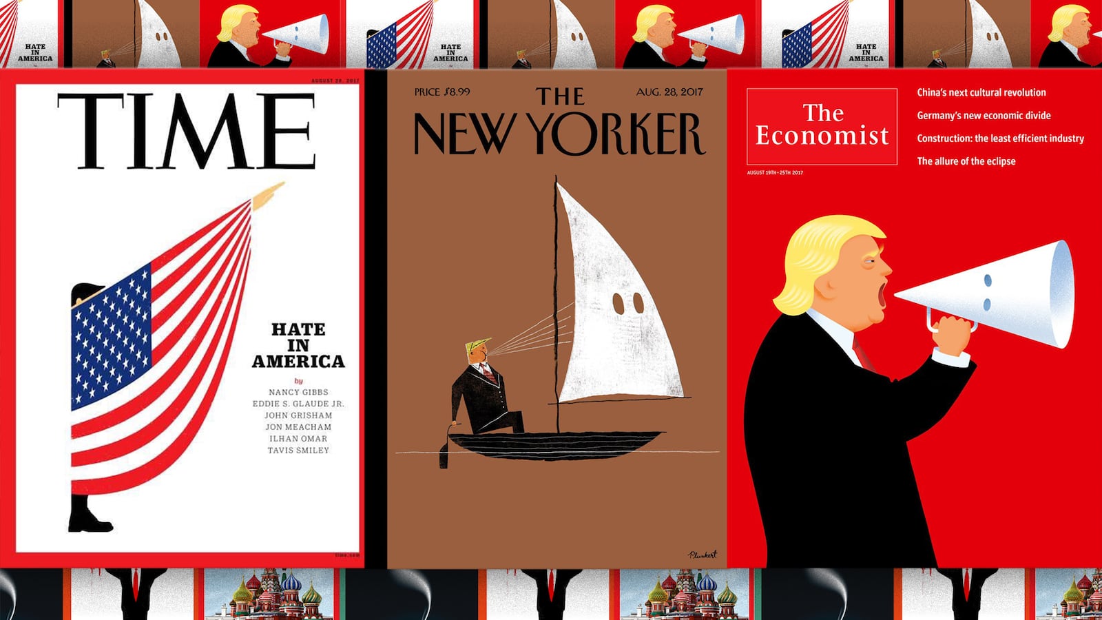
The results, as became clear Thursday night when each magazine posted its new cover online, were three powerful and alarming images linking the Trump presidency and America as a whole to the very worst impulses in collective human thought and behavior.
In Germany, the leading weekly Der Spiegel followed suit on Friday, publishing a cover image in which the face of a red-tied Trump-like figure is shrouded in a white hood. “The True Face of Donald Trump,” reads the German-language cover line.
“It’s a moment,” Remnick said in an interview. “Look, there’s been a Klan in this country and white supremacists in this country for hundreds of years. But the very idea that the president of the United States in 2017 would signal sympathy with that movement, and would do so with a kind of defiant insistence, is more than just a moment.”
Economist editor in chief Zanny Minton Beddoes told The Daily Beast that she changed cover plans at the last minute—delaying a non-news-peg package that she declined to describe because it will run later—in order to reflect the urgency of what was occurring in the Colonies.
“I decided on Wednesday morning we really had to do something,” she said from the U.K., noting that the Economist closes its issue at 11:30 a.m. Thursday London time. And in a departure from the norm, the magazine is running no cover line “because that image said it all and it didn’t need words,” she said.
Like Der Spiegel’s and the Economist’s cover image—illustrator Jon Berkeley’s cartoon-Trump, against a menacing red background, bellowing through a megaphone drawn to resemble a Ku Klux Klan hood—the New Yorker’s cover by David Plunkert focuses on the president, portraying an isolated Trump aboard a tiny boat going nowhere as he blows air into a white sail that is punctured with two holes; a somewhat different take on the Klan hood motif.
“The KKK hood is a gift in graphic terms. It’s simple, and its menace is instantly recognizable,” the Economist’s Berkeley told HuffPost in an interview. “It’s been used to great visual effect by many illustrators and cartoonists…I do think that cartoons and illustration can have a strong effect on people’s perception of particular people or events over time ― maybe even more so as the credibility of the printed word is dented…. We live in interesting times…The supply of weapons-grade lunacy in every corner of the globe seems to have ramped up considerably in the past year, which just gives more to push against.”
Time’s cover, by contrast, directs its fire not at Trump individually but at an entire nation riven by hateful compulsions: Edel Rodriguez’s stark image of a jackbooted, American flag-draped figure raising an arm in the Nazi salute.
“When I opened the email that had that image, I gasped,” said Time’s editor in chief, Nancy Gibbs, noting that Rodriguez is the same artist who produced the magazine’s iconic (if hardly prophetic) melting-Trump cover during last year’s campaign. “We take very seriously the power of symbols and how strongly people feel about the symbolism of the American flag—and we’re very respectful in how we treat it. But how do we respond when people who are promoting ideals that are antithetical to what the flag stands for wrap themselves in it? It is meant to be an uncomfortable image.”
Gibbs added that when she saw the other two magazine covers, she wasn’t surprised that they spotlighted Charlottesville—“I would have been surprised if they hadn’t”—or that Trump himself was front and center.
“It’s perfectly legitimate to make the president the focus,” she said. “He, and his reactions, continued to put himself in the middle of the story. There are so many dimensions to it, and they, too, reached for very powerful images. This is not an academic debate we’re having. This is a conversation about essential principles we live by in this country.”
Minton Beddoes said this week’s Economist cover targets Trump because the magazine’s covers always reflect not only the subject but the viewpoint of the lead editorial—which in this case characterizes the former reality television billionaire as “politically inept, morally barren and unfit for office.”
“For the rest of the world, this was an extremely important moment to take stock of the magnitude of what happened, and of the president and his personality,” Minton Beddoes said.
Unlike Time and the Economist, the New Yorker is not necessarily, or at least not always, a creature of the news cycle—especially not its cover art, which is more often seasonal and decorative than political. Yet this time the demand for immediacy was overwhelming, Remnick said.
In a train-wreck of a press conference in the pink-marbled, gold-plated lobby of Trump Tower late Tuesday afternoon, the president had angrily defended the thugs in Charlottesville as “fine people” and had posited an outlandish moral equivalency between gun-toting, Jew-hating white supremacists and the activists who’d showed up to demonstrate against them.
“I’d been thinking about a Charlottesville cover, but you wonder, what is it going to feel like in ten days?” Remnick said, noting his magazine’s three-day lead time from the Friday closing to the Monday newsstands (while subscribers can wait several days beyond that to receive their issue from the U.S. Postal Service). “But God knows racism and Trump will persist long past ten days.”
The night of the Trump Tower press conference, Remnick went to Mouly and said, “Françoise, let’s really press a little harder on the accelerator.”
Mouly issued “a clarion call,” Remnick said, to several dozen of the magazine’s regular artists and cartoonists with instructions to capture and distill the complexities of Charlottesville into a cover-ready graphic with attitude; and it had to speak for itself, because the New Yorker never prints explanatory cover lines.
The preliminary sketches that came back that night and Wednesday morning were rife with the tropes of bigotry and mobs: torches, neo-Nazi and Klan iconography, and so on.
David Plunkert, a Baltimore-based illustrator who had never been on the cover, submitted a sketch that was at once merciless and witty.
“I showed it to David and he started laughing,” Mouly said. “It was funny, and that’s always a good sign. Except it really needed to be right. Yes, you want to laugh, but you also want to cry…We could not not mark this moment. The difficulty for the artist, and the difficulty for us, is keeping the outrage up.”
For Remnick, Plunkert’s image was graced by simplicity and clarity—and not open to misinterpretation, willful or otherwise, as with the New Yorker’s controversial July 2008 “fist bump cover” by the magazine’s resident political cartoonist Barry Blitt, in which Barack and Michelle Obama were portrayed—in the fevered imaginations of their enemies—as AK-47-toting Muslim terrorists, with a painting of Osama bin Laden hanging heroically on the wall.
“You don’t want to have to explain it on CNN,” Remnick said. “A lot of people on the liberal side of the ledger objected [to the Obama cover], saying that ‘of course I get it, but other people out there in the country will take it literally.’ I thought that reading of it was patronizing. Nevertheless, I did end up on CNN talking to Wolf Blitzer, who I think said it was an image that could have appeared on the cover of Der Sturmer.”
Plunkert’s cover, titled “Blowhard,” is “a very clean, simple image,” Remnick said. “It’s a solitary figure on a little punt of a boat blowing air into a sail that has holes in it. It is somebody”—Donald Trump—“who is literally blowing air and accelerating the forces of malignancy.”


