The Grand Budapest Hotel is a screwball comedy that follows the adventures of a foppish concierge named Monsieur Gustave (Ralph Fiennes) and his trusted lobby boy Zero Mustafa (Tony Revolori) as they zigzag across the fictional Mitteleuropean country of Zubrowka in the years between the two World Wars. It is also Wes Anderson’s most ravishingly beautiful film. For the man behind The Royal Tenenbaums, The Fantastic Mr. Fox, and The Life Aquatic with Steve Zissou, that's really saying something.

To find out how Anderson and his team invented Zubrowka, assembled their hotel, and perfected every little visual detail of the movie—from the pink pastry boxes to the hand-lettered bathhouse signs—we sat down with production designer Adam Stockhausen. A Brooklyn resident, Stockhausen had recently flown to Los Angeles to celebrate his Best Production Design Academy Award nomination for 12 Years a Slave. On the eve of the release of The Grand Budapest Hotel, he was gracious enough to take The Daily Beast on a behind-the-scenes tour of Anderson’s latest creation.
Your first job with Wes was on The Darjeeling Limited. How did that come about?
I met Wes because I was working with his production designer as an art director. I went to India that way. My job was dealing with that train.
What do you mean by “dealing with the train?”
“Make the train. Go make a train for me.” It was just crazy intense. Just getting the train was a huge undertaking.
The train came from somewhere in India?
That is a real Indian Railways train—thankfully they let us borrow it—that we ripped completely down to the steel and then built a set inside of. And tried to soundproof it. This is my favorite story about the entire movie. The movie was shot while the train is moving down the tracks. We weren’t going in a loop, so we would go out in the morning and come back in the afternoon. But what that means for continuity—for what’s going by the windows, so it’s not going one way in the shots from the morning and another way in the shots from the afternoon—is that we had to make a mirror-image version of Cabin 40-41, where the characters are. We literally had to have another cabin on the other side so the scenery is going the same way.
That’s amazing.
It’s a fun story now. It wasn’t fun when we realized. We looked at the track runs and went, “Oh no.”
On Moonrise Kingdom, you were promoted to production designer. What did you learn working with Wes on that movie?
It’s a different process. And Wes’s process is changing and evolving all the time, too. He sketches his own thumbnail storyboards, then those get developed into more finished storyboards, and then he animates them so he can get a sense of the flow of the scene.
These are called animatics, right?
Right. I’m not sure if that’s a real word, or if we made it up. [Laughs] But Wes calls them “animatics” and so do I. And they’re really an animated version of the film.
The entire film?
Well, on Moonrise we did several sequences: the introduction to the Bishop house; the Camp Ivanhoe sequence; the Fort Lebanon sequence; the flood sequence. The main pieces. On Grand Budapest we did much more. We had most of the film, I think.
When you refer to Wes’s process changing, that’s something that has changed over time. He didn’t use animatics on Rushmore, for example.
He wasn’t even doing that on Darjeeling.
Why do you think these things have become such a big part of Wes’s filmmaking—to the point where, with Grand Budapest, almost the entire film was animated in advance?
It’s just so incredibly useful. If I were to say to you, “OK, we’re going to introduce the Bishops’ house. And there’s going to be a bunch of shots, and some of those shots are going to be a location, and then we’re going to cut inside the house, but it’s not just one set, it’s a bunch of different sets, because we want to slice the house apart and see it from all of these different views…”
If I started to describe it that way you wouldn’t really be able to see it. The Bishop house is my favorite example of this. Moving this way is one set. Moving this way is another set. Moving this way is a third set. Moving this way is a fourth set. The second floor is a fifth set. The front of the big red house is a location. Suzy’s binoculars on the widow’s walk, that’s a piece of scenery we were pushing around a parking lot on scaffolding to get the right background. And Suzy’s point of view watching Bruce Willis’s character and her mother is another location entirely. The animatic document is the way to hold all of that together so you’re not running around like a fool. You know what all the pieces are and how they fit together.
How would you describe Wes’s approach to the look of his films—and how that differs from other directors?
The last thing I would want to do is try to sum up Wes Anderson’s visual style in 50 words or less. But a few things certainly jump out. He has an amazing sense of composition and a very particular style of composition. He has a tremendous sense of color and is unafraid of color, which is inspiring. He’ll often say stuff like about a pink hotel he wants to make, and it’s exciting and terrifying because you have to get those colors right or else it could be a big mess. But I love how direct and bold he is with it—how he knows it’s going to work out.
Then the third thing I would say about his visual style is a love of the handmade. An appreciation of the real. That’s really exciting. And through the years we’ve gotten to make some amazing things that are really special.
What stands out from Grand Budapest—something really special that you made?
There’s always the luggage, which I didn’t make. [Laughs] Prada made that. But the beautiful porcelain pendant that Agatha (Saoirse Ronan) wears. The pastries all being handmade, and the Mendl’s boxes. The klubeks were all made from scratch. We designed an entire currency for this fictional country based on old French francs. Kind of incredible. Each one was handmade and colored and hand-aged.
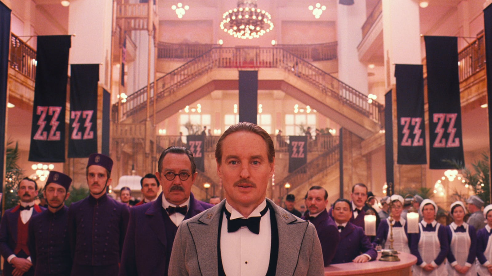
That said, it’s hard to not be proudest of the main thing. So the hotel. When Monsieur Gustave is interviewing Zero and you walk through the lobby and see the entire world of the Grand Budapest—I’m proud of that.
When Wes said “I want a pink hotel,” was that the first seed of the movie? Was that where it started?
He had already gone on a first scout. I was working on 12 Years a Slave, so I wasn’t able to join him. But then I got this flood of information, like, “Here’s the script. Take a look. Give me a call.” We had a first call and then it was like, bang—“Here’s 197 folders full of location photos with very interesting German names that you’re going to have a lot of trouble with. But go for it.”
So Wes went on a Grand Tour of sorts to get inspiration for the look of the movie?
They went all through Eastern Germany and Southern Germany and the Czech Republic and Prague, and a town called Karlovy Vary that turned out to be very important for us later. Hungary. Budapest. Vienna. A big journey. And then as soon as I wrapped I went to Europe and did a greatest hits scout from what he had seen, and then went to meet him and we were rolling.
Was the Grand Budapest Hotel itself the first thing you had to design?
It really was. The movie is like, the hotel … and then everything else. The hotel was the way into it. If we figured out the visual style of the hotel, everything else was going to flow from that.
Let’s walk through that visual style. We see it at several different periods, from the height of its opulence in the 1930s to the shabby Communist look of the 1960s.
There was a mountain of research. We were looking at photographs of a bunch of different Grand Hotels—a pile of photographs, and we were picking out our favorites. Then we went to visit places. So we were looking at the Hotel Adlon in Berlin. We went to the Grand Hotel Pupp in Karlovy Vary in the Czech Republic. Everywhere we went, we were like, “Look at the lamps here. These are incredible.”
And then there’s the location itself. Wes had found this department store in Görlitz that is an amazing Art Nouveau building that was just standing there empty, and we were able to walk in and build our thing. He found that on his first tour.
And he knew right away that it would become the hotel?
There was some discussion about it, but it was pretty clear. It couldn’t have been anything else. When he walked into this department store, even with it empty, he knew right away that the concierge desk had to go in this central spot. It was the perfect focal point. All the stairs were pointing right at it. He knew right away that the shootout was going to happen across the interior gallery, on the top floor.
So how did you transform it into what we see on screen?
You take those givens and you start to piece them together. The look of the 1930s hotel was a response to this location that we had found. It had this Jugendstil look to it. Then we added our favorite pieces in. Our favorite coat check, our favorite bar…
Things you had seen in other hotels.
Right. And some things even came from film sources. We had been looking at this Ingmar Bergman film called The Silence, with this boy walking the corridors of a hotel. And we just lifted it. We copied their doors.
The chase sequence in the history museum—that’s also a film reference, right?
It’s an homage to Alfred Hitchcock’s Torn Curtain. If you watch Torn Curtain and start where he’s walking out of the hotel and the women are scrubbing the floor, and pick that up with Kovacs (Jeff Goldblum) walking down the stairs with the women scrubbing the floor in Grand Budapest, it follows pretty exactly. It’s the most direct homage we’ve done. It’s exciting because you have this starting point that you then get to work into your locations and figure out how to match up the pieces.
I noticed a bunch of signs on the walls of the Grand Budapest Hotel’s bathhouse. A detail like that—were those already there when you found the location, or did you put them there?
Oh no, that’s me. We do these layouts and have these charts with all the signs.
I remember one read “Kidney Ailments.” Where did that come from?
We did a bunch of research on legit bathhouse signs, then we said, “OK, everybody come up with 50 signs and we’re going to take the best ones.” So everybody comes up with 50, I pick my favorites and send them off to Wes. He picks his favorites. And the list narrows down to the best ones. Then we paint them all. They’re all handmade.
You can tell. You can almost believe they’re real, but there’s a humor to them that perfectly encapsulates this skewed Mitteleuropean universe.
That’s what we were going for.
Most people would just assume that Wes Anderson is a total control freak who dictates every little detail down to the lettering on those signs. But that’s not quite how it works, is it?
Not really. It’s a conversation. But Wes does look at every piece of it. We talk about every piece of it. We talked about every one of those signs. He looks at the layouts and says, “I like this and this and this. I’m not in love with that one. That one looks fake.” Then we do another version. And another one. [Laughs]
Is there an anecdote from the making of this movie that would give people a sense of what it’s like to work with Wes Anderson?
A set to keep an eye out for, that’s a really fun one, is when Bill Murray picks up Zero and Monsieur Gustave in the field, and then he drives them to the train station. That train station was a lot of fun, and it’s a bit of a trick shot. The car comes under the overpass, we boom up, the car pulls in, the train pulls, then run across to the train. It seems kind of simple, except that there’s no train station there. It’s just an overpass. And we used two cars, because one comes zipping through the frame and then the other immediately slides in from the other side. We had to find two matching taxis to pull that off. Then the train comes in, and it’s only about two feet deep because we had to fit the train and the car on a narrow little road. The train is literally made out of cardboard with smoke coming out of the top it. When you look at it and you know that, you can almost see it. But it really works.
I would have had no idea.
Wes knew he wanted a shot that was interesting. He knew he wanted it to be a single shot thing somehow. But I was concerned that we were a little flat on our backs with time and we didn’t have a lot of money. Sometimes those restrictions make something more fun. If we had all the money in the world, we never would have done something that interesting.
Was there an inspiration for Mendl’s bakery, which plays a big part in the plot?
There was this location in Dresden that was the front of the bakery, that was overwhelmingly beautiful. It has this tile work that is just incredible. It’s not a bakery, actually. It’s a creamery. Cheese and milk and so on. But it was so beautiful it became the direction for Mendl’s.
Also, with the entire film we were trying to get a strong upstairs-downstairs quality. That’s why when you go into the backrooms of the hotel it’s shockingly messy. And we wanted the same thing with Mendl’s. You go from an absolute jewel box of a storefront and counter to the bakery in the back, it becomes soot-covered and almost Hansel and Gretel. That was intentional, too.
What was the thinking behind using models for the funicular that runs up to the hotel—and for the first shots of the hotel itself?
That came about fairly early. There’s this town, Karlovy Vary. This beautiful little spa town in Czech Republic. A ribbon of pastel-colored buildings and then a hill. There’s one magnificent hotel down in the city and a couple more on the hill, and there’s funicular running up the side of the hill. And there happens to be a rock with stag on top of it as a monument right outside of town. It has all the pieces that are amazing and that were inspiration for the setting of the hotel. But you can’t get them in one frame, and it was clear from early discussions that Wes wanted to see the hotel in this very specific way, and introduce it with the town below, the funicular taking you up to the hotel on the hill—just so. But there’s nothing like that.
It doesn’t exist.
It doesn’t exist. So we knew we had to make it. Now, there’s the new way of doing that—making a digital painting of it and a 3D CGI model of it. Then there’s the old way of doing it—the handmade model way. I mean, we did plenty of new tricks. The movie isn’t a rejection of technology or anything; we did plenty of color correction and digital augmentation. And even the models weren’t one big model. They were the hotel model and the town model and the hillside model and the funicular model, all in different scales, then we stitched them together digitally.
So it’s not a rejection of technology. It’s really more a love of the handmade. Take the background for it—the painting that’s sort of a riff on Caspar David Friedrich. That was done after we shot the film. When Wes started putting the pieces together, he said, “Let’s go absolutely all the way with this. Let’s commission a painting.”
Why is handmade so important in Wes’s films? We’ve seen it before: the stop-motion sea creatures in The Life Aquatic, for example. Or the whole of The Fantastic Mr. Fox.
I think it’s just something that he’s interested in exploring and working through as an artist. There’s just no denying that handmade is more fun. So why not? Plus, it does the trick.


