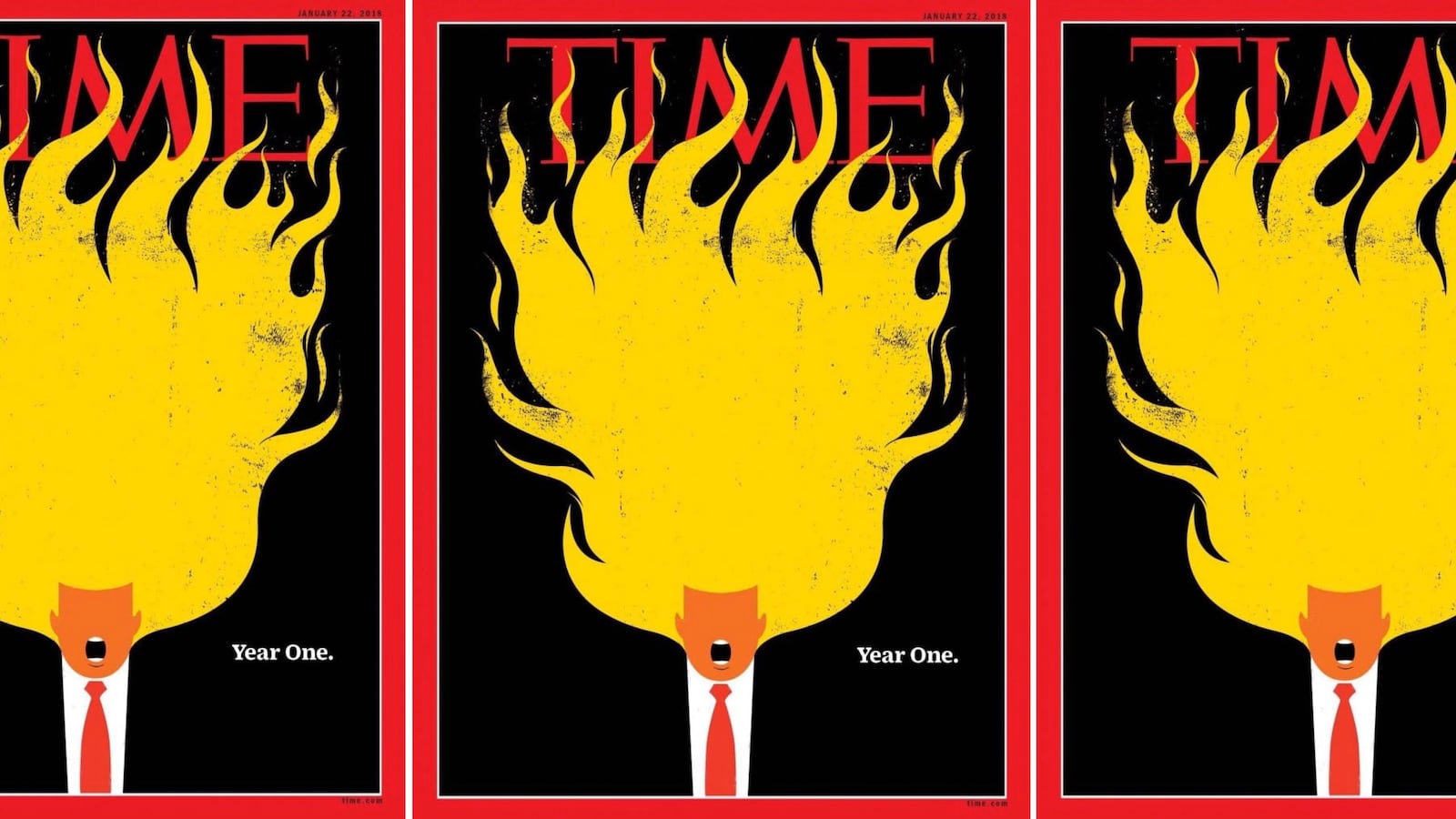
When Edel Rodriguez’s illustrations of President Trump for publications like Time or Der Spiegel are published, the internet does cartwheels, usually of cackling ecstasy, as the absurdist but acutely political images make their impact. His unique styling of Trump’s hair and features is now an instantly recognizable style of its own.
The latest issue of Time features another of Rodriguez’s distinctive illustrations of Trump, his mouth agape and his signature hair a huge bouffant of licking flames. The headline: “Year One.”
Rodriguez told The Daily Beast that the inspiration for the latest illustration was the controversy around Michael Woolf’s book, Fire and Fury: Inside The Trump White House. Friends had asked what he would have done instead of the rather drab cover publishers Henry Holt chose. Rodriguez imagined another roaring Trump mouth, orange face, flaming hair, both atop a minuscule White House and U.S. Capitol building.
“I thought the image was just for me and my friends, but it went everywhere,” Rodriguez told The Daily Beast. He should be used to the virality by now.
Other of his illustrations have also featured flames and a furious and animated Trump. Rodriguez has imagined Trump melting, Trump and North Korean leader Kim Jong Un as babies riding a missile, a baby Trump surrounded by nuclear warheads, Trump brandishing a bloody knife while holding a bloodied head of the Statue of Liberty, and a flaming Trump head flying toward a comparatively tiny, and vulnerable, earth.
After the president’s much-criticized response to the white supremacist violence in Charlottesville, Virginia, at which counterprotestor Heather Heyer was killed, Rodriguez imagined Trump’s head as a Klansman hood atop a dark suit and red tie.
The illustrative elements and style remain the same, even if the images become more and more outrageous and piercing.
“Since the beginning my thinking was that the danger of this presidency was that people would ignore it, that life would begin to seem normal. I wanted, through this branding and imagery, to remind everyone of what was happening under Trump. You’d go back to living your life, then, boom, he, this thing comes screaming at you again. The images are a reminder that it hasn’t gone away.”
The constantly braying mouth and furiously flaming face and hair are inspired by the campaign rallies where then-candidate Trump yelled for the physical ejection of protesters.
“He has a tyrannical, dictatorial way of speaking to people,” says Rodriguez. “President Trump seems a very erratic personality, someone that never takes the time to listen to anybody. He just has his mouth open, yelling or talking over everybody else. You can’t get a word in with this guy. He thinks he’s right all the time. He has a history of running a business one way, and nobody ever talks back to him. That’s the imagery that came to me.”
If Trump’s features seem comically wrought, Rodriguez isn’t intending to make fun of the president physically, but rather uses the features to make a point about his personality. “He is known for his hair, but everyone has their own hair issues.”
Donald Trump Jr. tweeted out his approval of one Rodriguez Time cover, imagining Trump as three swinging wrecking balls, “dismantling government as we know it,” as the accompanying headline went.
As for for the president, “Of course he loves Time magazine, so of course he’s going to see them,” Rodriguez says of such covers.
The worldwide appreciation of the covers has come as something of a surprise to Rodriguez, a Cuban-born American who came to the country in 1980 via the Mariel boatlift. He has been making illustrations for 23 years, and for him, “it’s like going to work every day. I do my thing, and try to find a way to tell the story in the best way in the moment. You don’t go to work every day and expect your work to end up everywhere.”
He is influenced by the particular graphic styles of Cuban and Polish poster art, and pop art more generally. Growing up in Cuba, he recalls the movie posters that were made in the country itself because they could not be imported. They typically had two or three colors, because there was not enough paint for more, he says.
“That tradition is in my work,” says Rodriguez, “although I don’t agree with any political position of Cuba. I am first an American. I have a family, which is American. I grew up there under a dictator. The reason I did the Trump images from the beginning is that I had lived under tyranny, under a dictatorship that becomes normality. I saw a lot of indicators that Trump shared with [Fidel] Castro, so that was my first trigger.”
Rodriguez is appalled by Trump’s “horrible racist policies against immigrants and other minorities, which was proven by his words after Charlottesville.”
Given the publicity and heat they generate, Rodriguez says he feels the pressure now to top the last Trump image he has made.
“I used to think it wouldn’t be an issue, that it was the image that was important. But then you do the seventh, eighth, ninth cover, and people get excited and so you think, ‘Wow, I’ve got to do something else here.’ In a strange way it comes naturally. I basically tell stories, and I find different thing to grab on to when I draw.”
Rodriguez has close relationships with his editors; the Trump and Kim Jong Un babies-atop-a-missile cover image was so good, he says the editor of Der Spiegel rejigged the content of the magazine to work around it. He is always pushing himself to go further. There isn’t endless reworking of images; the first idea that comes to him, is—give or take modifications—the image that becomes the cover.
He has, he says laughing, just finished an image for Der Spiegel that he initially did six months ago. “I felt I was going way too far, but they loved it.”
Rodriguez said he didn’t dream of Trump, “but I do see his face in things around the street when I’m walking, like garbage can with a yellow top. I like those interactions with the world which trigger ideas in my mind: orange cones on the road, orange street signs. I make a mental note and sketch it.”
So orange is Rodriguez’s basic Trump trigger?
“Yeah, pretty much,” he laughs.


